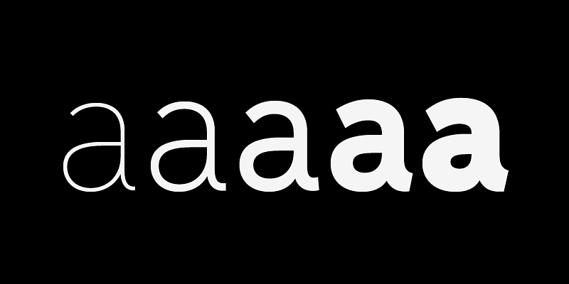
Elido (Odile in reverse) is the sans counterpart to Odile, a serif type. Together they form a sans and serif superfamily with a wide range of variations for editorial and display use. Elido follows Odile’s proportions and matches the weight distribution and typographic color of its serif twin. Odile’s conceptual approach is echoed in the structure and anatomy of the Elido family. The arched stroke low off the stem reveals a script characteristic most pronounced in the Elido Upright Italic. This particular interpretation is gradually diminished in the Italic and becomes even less emphasized in the Regular style. Six balanced weights, from an elegant Light to a pronounced Black, are in tune with three display solutions and a set of beautiful Ornaments. Sans serif initials amount to a rare finding. The charming mono-linear Elido Initials come in two flavors, elaborate and rational, designed to hold their own in editorial and headline sizes. This type design boasts an extensive character set and many OpenType features. OT stylistic variants offer a one-storey ‘a’ for the roman weights, alternate ‘g’ and ‘s’ designs for the italics, and a variant glyph ‘s’ for the Upright Italic. Elido is an excellent choice for editorial and display use. For additional license options like app and enterprise, visit Elido on [Type Network](https://store.typenetwork.com/foundry/kontour/fonts/elido).