Floodfonts

11 fonts
Aquavit

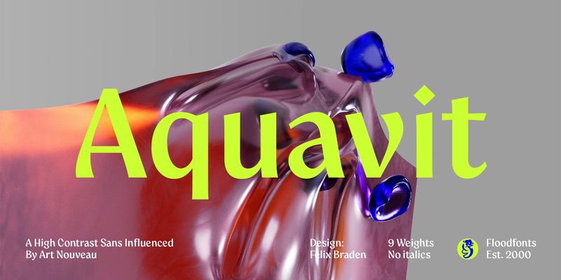
Aquavit – A unique, non-conformist display family for brands that like to break the mold. Aquavit is a high-contrast Sans inspired by the organic forms, flowing lines, and expressive motifs of the Art Nouveau movement. Combining the crisp precision of a high-contrast sans with the warmth of vintage design, Aquavit walks the line between cool sophistication and handcrafted natural charm. The slightly top-heavy design, with subtle calligraphic influences, breathes an air of extravagance and grace, making Aquavit a go-to choice for brands in the realm of exclusive lifestyle products – whether you're in beauty, fashion, jewelry, music, food & beverage, interior design, or anything in between. Aquavit brings a unique sense of character and authenticity to any creative project.

sans-serif
foundry
commercial
Arpona

Arpona is a typeface with small wedge serifs and a strong character, ideal for corporate design and all projects characterized by a sense of individualism – for example art, fashion, food, beverage and lifestyle topics. Because of its display qualities, Arpona is a good choice for packaging, advertising and editorial design and is well readable even in running text on screen.

serif
foundry
commercial
Arpona Sans

Arpona Sans is a contemporary sans serif family inspired by the work of Edward Johnston for London Underground. Arpona Sans combines the esthetics of a geometric Sans with the usefulness of the humanist concept and the calm of the modernist proportions. Arpona Sans is a good choice for editorial design, branding, app design and web design – a workhorse well readable even in running text on screen.

sans-serif
foundry
commercial
Bigfish

Bigfish (created in 2008 by Felix Braden) is a comic-like slabserif font with top-heavy proportions and looks a bit overinflated. The typeface is reminiscent of the design of old circus posters, but its computer-based curve style also gives it a very modern touch. The creation of the typeface is based on the idea of designing a handmade looking typeface, exclusively on the screen, without the use of paper and pencil.

display
foundry
commercial
Capitana

Capitana bridges the gap between Geometric Sans and Humanist Sans. All shapes are constructed from basic geometric forms and are designed with open apertures according to the classic proportions of the Roman Antiqua. Distinct ascenders and pointed apexes with deep overshoot give it a cool beauty and classic elegance. Capitana is an ultimate allrounder: with nine weights from Thin to Black, it offers both light and extremely heavy weights for striking headlines. Its open forms make it particularly legible in small sizes, and it also offers several styles for running text. Capitana has a powerful opentype engine with small caps plus corresponding figures, tabular and oldstyle figures, arrows, alternate letters for g and a, as well as fractions, subscript and superscript, However, with its minimalist design and low contrast, it is best suited for on-screen use – meaning web design, user interface design (UI&UX), and app design.

sans-serif
foundry
commercial
Ferryman

Ferryman is designed for everyday use – a Blackletter typeface for the contemporary reader. Unfamiliar Blackletter characters have been replaced with adapted latin characters or with letters from other historical scripts that are more legible to a modern audience. Ferryman is the antidote to the overused geometric and neogrotesk styles. An expressive display typeface with a strong character, it is perfectly suited for counterculture projects and progressive concepts e.g. in visual art, indie music, and alternative lifestyles. With nine weights and corresponding italics Ferryman offers a wide range of creative possibilities. Each style offers 590 glyphs supporting all Western-, Eastern- and Central-European languages and comes with four sets of numbers and various currency symbols.

blackletter
foundry
commercial
Hydrophilia

The Hydrophilia family was created in 2003 by Felix Braden as a further development of the Moby typeface. It is a grid-based design and comes with two fonts: The gothic font (Liquid) is a revised version of the pixel font (Iced). Hydrophilia Liquid features many letterforms with a diagonal axis, and is a reminiscence of the technical fonts used on early liquid crystal displays. The pixel font Hydrophilia Iced is optimized for a font size of 11 pixels.

display
foundry
commercial
Moby

Moby was created in 2002 by Felix Braden as a corporate and headline font for the Cologne based design bureau Glashaus. The letterforms are insprired by the logotype of the legendary Bauhaus School in Weimar (Germany) and are created on a 5 x 5 Pixel grid. The family comes with 3 Fonts: Moby Bold, Regular and Monospaced.

display
foundry
commercial
Pulpo

A friendly and comfortable looking typeface inspired by Century Schoolbook and Clarendon. Massive body very suitable for running text on print as well as on screen. Longer extenders give text a bit more air to breathe and improve legibility in small text sizes. Bolder weights have strong headline qualities. The familiarity of the letterforms conceals some nostalgia and makes it a good choice for food and lifestyle themes and for everything that was better in the good old times.

serif
foundry
commercial
Pulpo Rust

Pulpo Rust digitally simulates a handmade woodprint. For each of the 560 characters, the font offers four different qualities of print and gives you the opportunity to create a vivid typography according to your own visions. To create the fonts, 193 glyphs were manually cut into five wooden plates and carefully printed by hand. From countless

display
foundry
commercial
Sirenia

Sirenia is a friendly display face with rounded corners and flowing transitions. The letters have a very organic look and feel, as if naturally grown. There are clear calligraphic influences in the typeface, since the letterforms are based on a written construction, all drawn with a single stroke. This authentic natural look is ideally suited for lifestyle products, the food & beverage sector and for sustainable design. Sirenia’s 1270 characters contain many decorative letters and swash variations for initial, medial and final letters. This gives the designer the possibility to work more as a lettering artist than a typographer and to create lively logotypes according to his own ideas, matching the respective letter combination.

serif
foundry
commercial