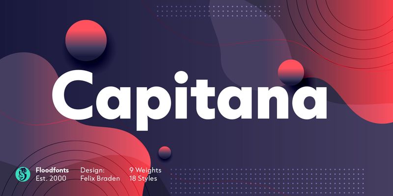
Capitana bridges the gap between Geometric Sans and Humanist Sans. All shapes are constructed from basic geometric forms and are designed with open apertures according to the classic proportions of the Roman Antiqua. Distinct ascenders and pointed apexes with deep overshoot give it a cool beauty and classic elegance. Capitana is an ultimate allrounder: with nine weights from Thin to Black, it offers both light and extremely heavy weights for striking headlines. Its open forms make it particularly legible in small sizes, and it also offers several styles for running text. Capitana has a powerful opentype engine with small caps plus corresponding figures, tabular and oldstyle figures, arrows, alternate letters for g and a, as well as fractions, subscript and superscript, However, with its minimalist design and low contrast, it is best suited for on-screen use – meaning web design, user interface design (UI&UX), and app design.