0123456789
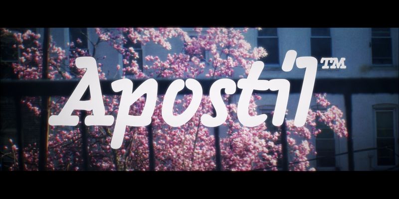
A simple hand lettering font in three weights
serif
hand lettering
branding
A simple hand lettering font in three weights

A faux typewriter style to pair with Interpol Sans, Interpol Correspondence is spaced wider and includes ample ink traps. Interpol Correspondence features the closed apertures that result from expansion contrast typically found in typewriter faces. While it is not fixed-width, some of the proportions are a nod at this provenance: The lowercase I and l are very wide, and feature serifs; meanwhile, the cap M and W are narrow. All Interpol styles come with language support for Greek and Cyrillic. [View Interpol Sans](https://fonts.adobe.com/fonts/interpol-sans) For additional license options like app, enterprise, multi-user, and self-hosted web, visit [Interpol Correspondence on Type Network](https://store.typenetwork.com/foundry/famirafonts/fonts/interpol-correspondence).
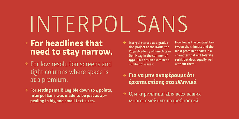
Interpol Sans is the sans serif branch of a family of robust, low contrast typefaces designed for legibility in low resolution situations. It performs particularly well on media like television and computer screens, or in projections and on lightboxes. The Interpol family of typefaces also runs a narrow. While it is not quite condensed, Interpol Sans consumes less space than classic proportions prescribe. In Dutch this is called zuinig: thrifty. It means that the Interpol will fit just a few more words in one line of text than a run-of-the-mill sans serif. This is interesting for narrow columns and headlines, or for publications which need to accommodate a lot of text on a page without looking crammed. [View Interpol Correspondence](https://fonts.adobe.com/fonts/interpol-correspondence) For additional license options like app, enterprise, multi-user, and self-hosted web, visit [Interpol Sans on Type Network](https://store.typenetwork.com/foundry/famirafonts/fonts/interpol-sans).
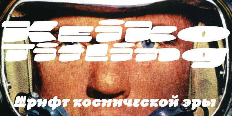
Keiko Titling is a flyer font, based on a font that was originally released by FontShop in the 1990s under the name ffBlocker, the first font with clean outlines I ever drew. Keiko Titling is a significant update in terms of style, weight range and language support. Fatter is better!
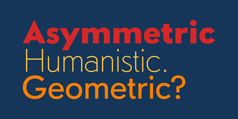
Sonar Sans is the attempt to marry the rule of geometric, historical form with the forgiving, human expression of early gothic typefaces. Nothing about this typeface is truly symmetrical. The geometric nature of the underlying model merely served as a starting point to find the shapes of a low-contrast expansion typeface. For additional license options like app, enterprise, multi-user, and self-hosted web, visit [Sonar Sans on Type Network](https://store.typenetwork.com/foundry/famirafonts/fonts/sonar-sans)