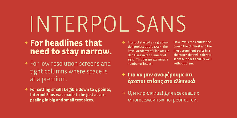
Interpol Sans is the sans serif branch of a family of robust, low contrast typefaces designed for legibility in low resolution situations. It performs particularly well on media like television and computer screens, or in projections and on lightboxes. The Interpol family of typefaces also runs a narrow. While it is not quite condensed, Interpol Sans consumes less space than classic proportions prescribe. In Dutch this is called zuinig: thrifty. It means that the Interpol will fit just a few more words in one line of text than a run-of-the-mill sans serif. This is interesting for narrow columns and headlines, or for publications which need to accommodate a lot of text on a page without looking crammed. [View Interpol Correspondence](https://fonts.adobe.com/fonts/interpol-correspondence) For additional license options like app, enterprise, multi-user, and self-hosted web, visit [Interpol Sans on Type Network](https://store.typenetwork.com/foundry/famirafonts/fonts/interpol-sans).