HomeListsChatDirectory
Typedex
HomeChatListsDirectory
Guide

The best sites to discover fonts

“Best font site” depends on what you're trying to do: use type for free, license something commercial, get inspired, or find what's actually worth your attention right now. Those are different jobs, and different sites are built for each.

Here's the honest map, by category, and where Typedex fits: it's the discovery layer — a data-backed engine that ranks type by live community signal and points you to what's trending, new, and distinctive, then on to wherever you get it.

Try it in Typedex

Search any font by name, or a vibe like “serif”, “mono”, “display”, “grotesk”.

Font sites by what they're good at

Most people use more than one. The trick is knowing which job each does best.

Type of siteBest forExamplesTradeoff
Free librariesBrowsing and using fonts at zero cost, with instant web embedding.Google Fonts, FontshareLarge but ubiquitous catalogs — everyone uses the same families, so they're a weak signal of what's distinctive.
MarketplacesBuying and licensing commercial typefaces from many foundries.MyFonts, Adobe Fonts, Fonts.comOptimized for transactions, not discovery — sorting leans on sales and promotion, not live community signal.
Inspiration archivesSeeing fonts used well in the wild and learning pairings.Typewolf, Fonts In UseCurated and editorial, updated on a human schedule rather than continuously.
Discovery enginesFinding what type is trending, new, or worth attention right now.TypedexA layer on top of the others — points you to fonts, then to where you get them.

Categories are descriptive, not ranked. Named sites are examples of each kind, not endorsements.

What discovery looks like: trending this week

A live sample, ranked by momentum from real votes and saves. See the full list on trending fonts.

Fraktion

Fraktion

Pangram Pangram Foundry

01234567890123456789

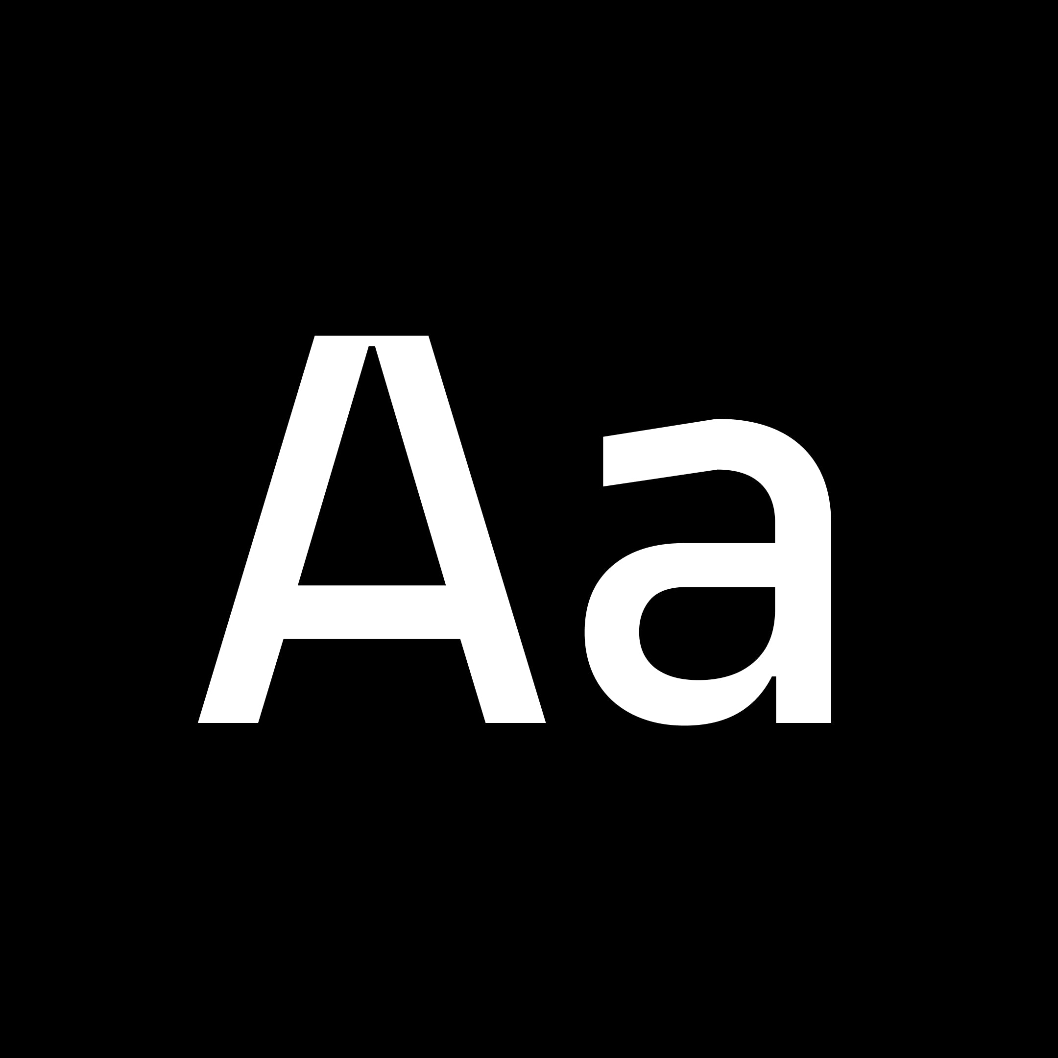
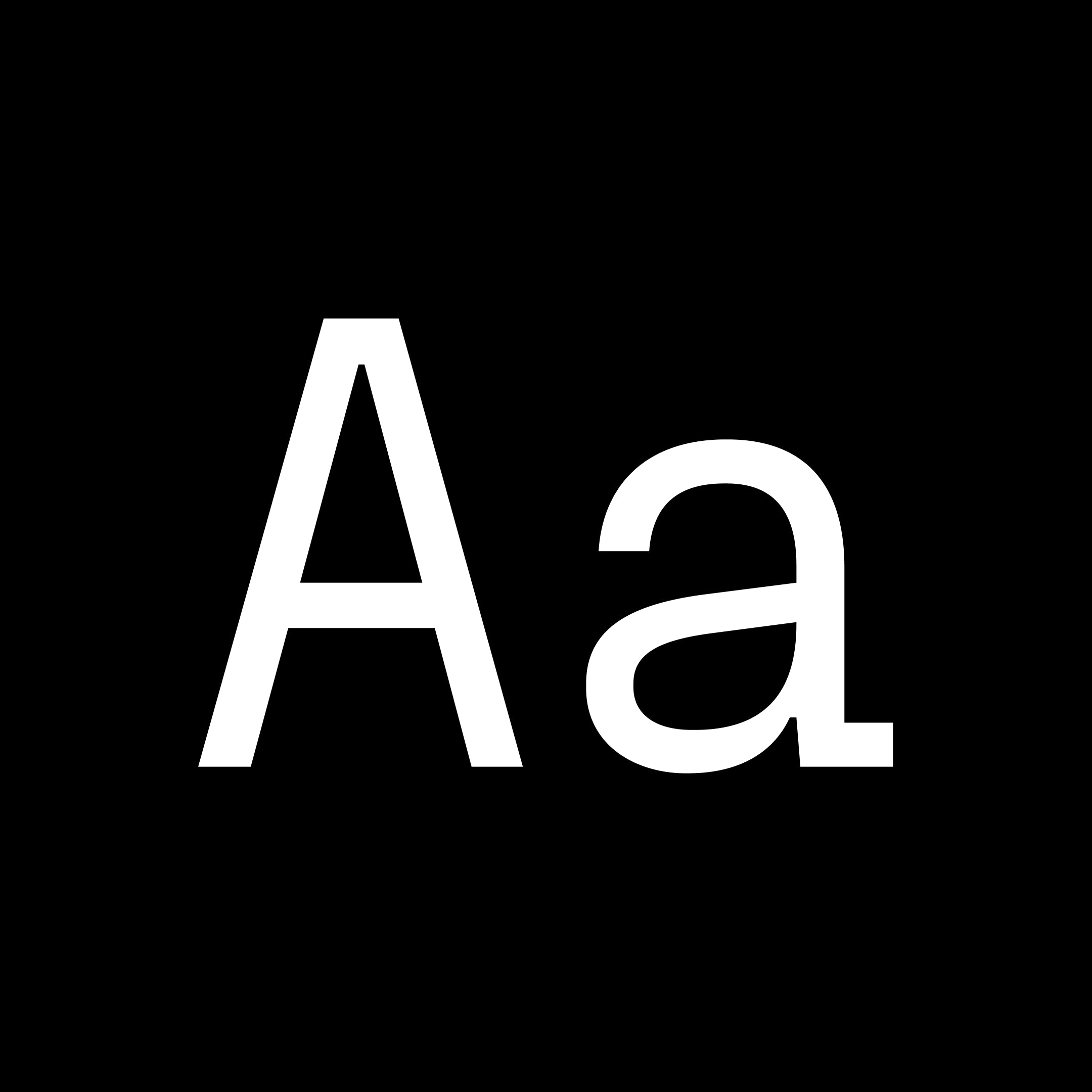
Fraktion Sans is a contemporary grotesque exploring the space between mechanical sturdiness and expressive clarity. While its inspiration stems from vintage signage lettering, the final design is a rather far departure. The square shape and the compact capitals are the only remnants of the original influence and when set in all-caps the industrial spirit is vaguely present. Even so the typeface has been shaped to a modern, versatile allrounder with a slight technical feel that works great in sober applications for screen and in editorial - and still maintains character to be a strong voice in branding. An exaggerated spur on the lowercase 'a' and ink traps are defining visual characteristics just as the squared-off rounds’ true verticals help create a steady cadence. The proportional Sans is complemented by a fixed-width design: Fraktion Mono. The refitted letter shapes of the monospaced design add a surprising playfulness to a genre that generally feels more technical, making Fraktion Mono’s cuts the more informal bunch of the family. Both typefaces offer plenty of typographic solutions through OpenType features like case sensitive punctuation, stylistic alternates, fractions and slashed zero. The 7 upright weights each have an italic counterpart and both sets are available as variable fonts.
mono
pangrampangram
grotesque
Solar

Solar

Dinamo

01234567890123456789

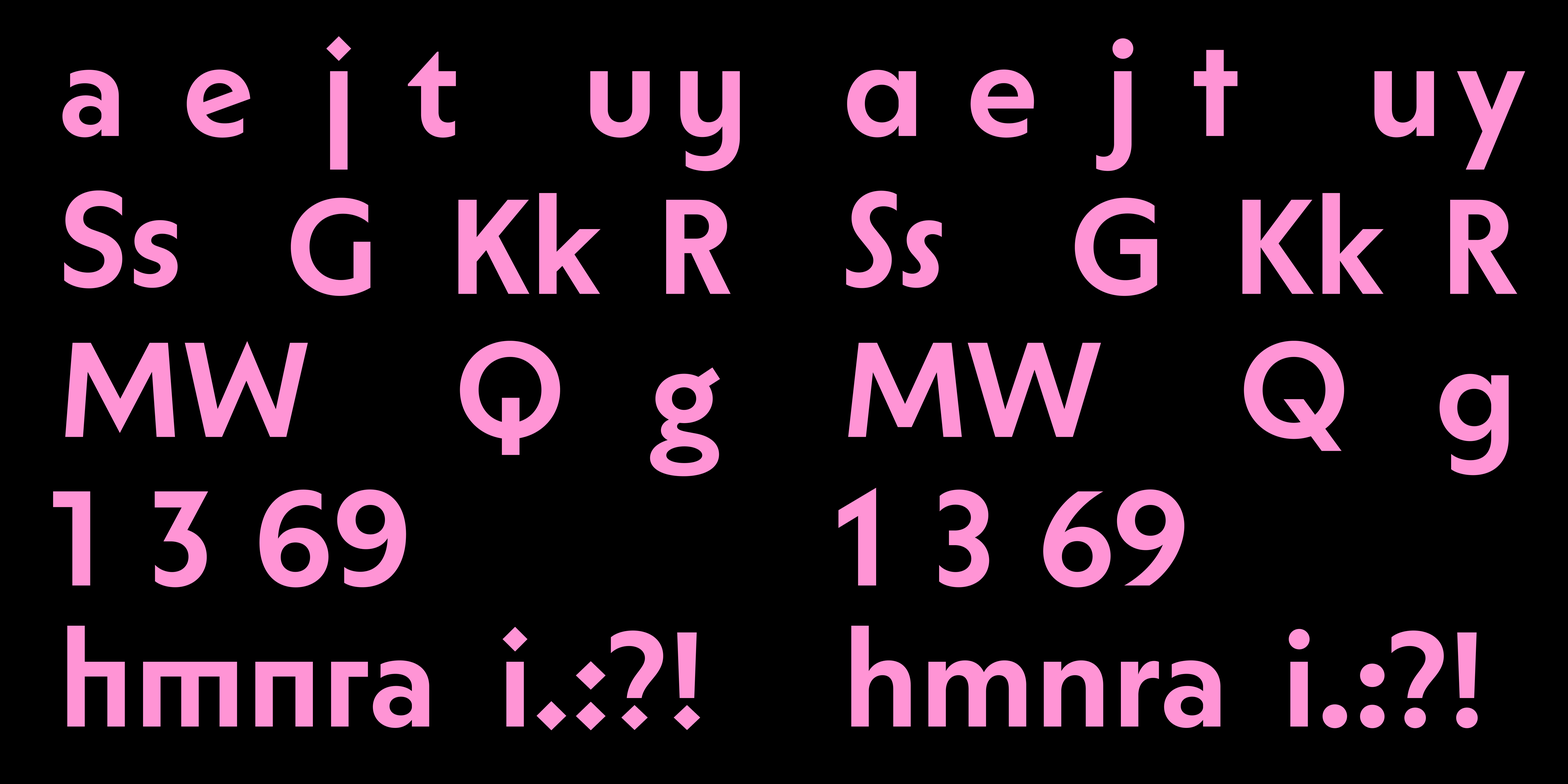
ABC Solar is a highly customizable geometric sans with a large weight spectrum and matching italics. You can change how it looks by selecting from a huge range of alternates — and by choosing between straight or angled cuts. It’s giving Kabel, Vogue, Metro No. 2, Johnston, and Erbar-Grotesque plus Futura, but calling it what it is, Solar lives in that space between Remix and Homage of all the above—with a dash of poetic license thrown in.

sans
dinamo
geometric
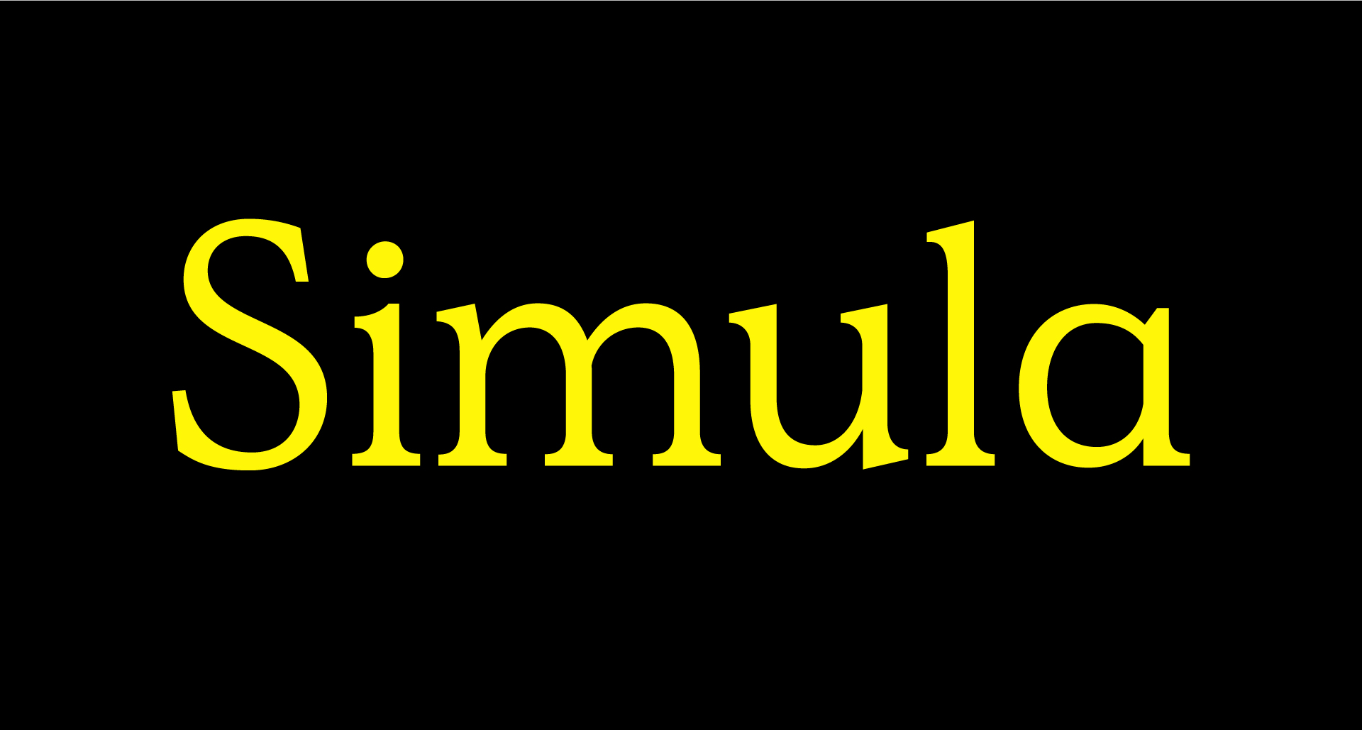
Simula

Simula

Sharp Type

01234567890123456789

Simula is a contemporary typeface that draws inspiration from the Plantin model, blending traditional Roman proportions with a modern perspective. It is characterized by a unique tension between low-contrast strokes and angular serifs, making it suitable for both display and text applications. The design is known for its rational yet contradictory qualities, particularly evident in its lowercase forms.

serif
sharptype
display
PP Model

PP Model

Pangram Pangram Foundry

0123456789

Model pays tribute to the world of plastic model kits, drawing inspiration from the iconic Japanese brand Tamiya. Renowned worldwide for its highly detailed and precise assembly kits, Tamiya’s legacy serves as the foundation for this design, celebrating the meticulous art of model-making. The typeface blends nostalgia with modern precision, capturing the essence of the assembly process through its clean, modular forms and mechanical aesthetic. PP Model features a range of four families, from the default Model version to the monospaced variants and experimental Plastic styles. Its design fosters creativity, offering typographic options that embody the concept at varying levels, emulating the connected components of model kits in their forms. In total, the typeface includes 72 fonts, available in both upright and italic styles, featuring extensive Latin support, the Japanese alphabets Hiragana and Katakana, Japanese punctuation, and measurement characters that are rarely found.

sans
pangrampangram
geometric
Eternal Collection

Eternal Collection

Blaze Type

0123456789

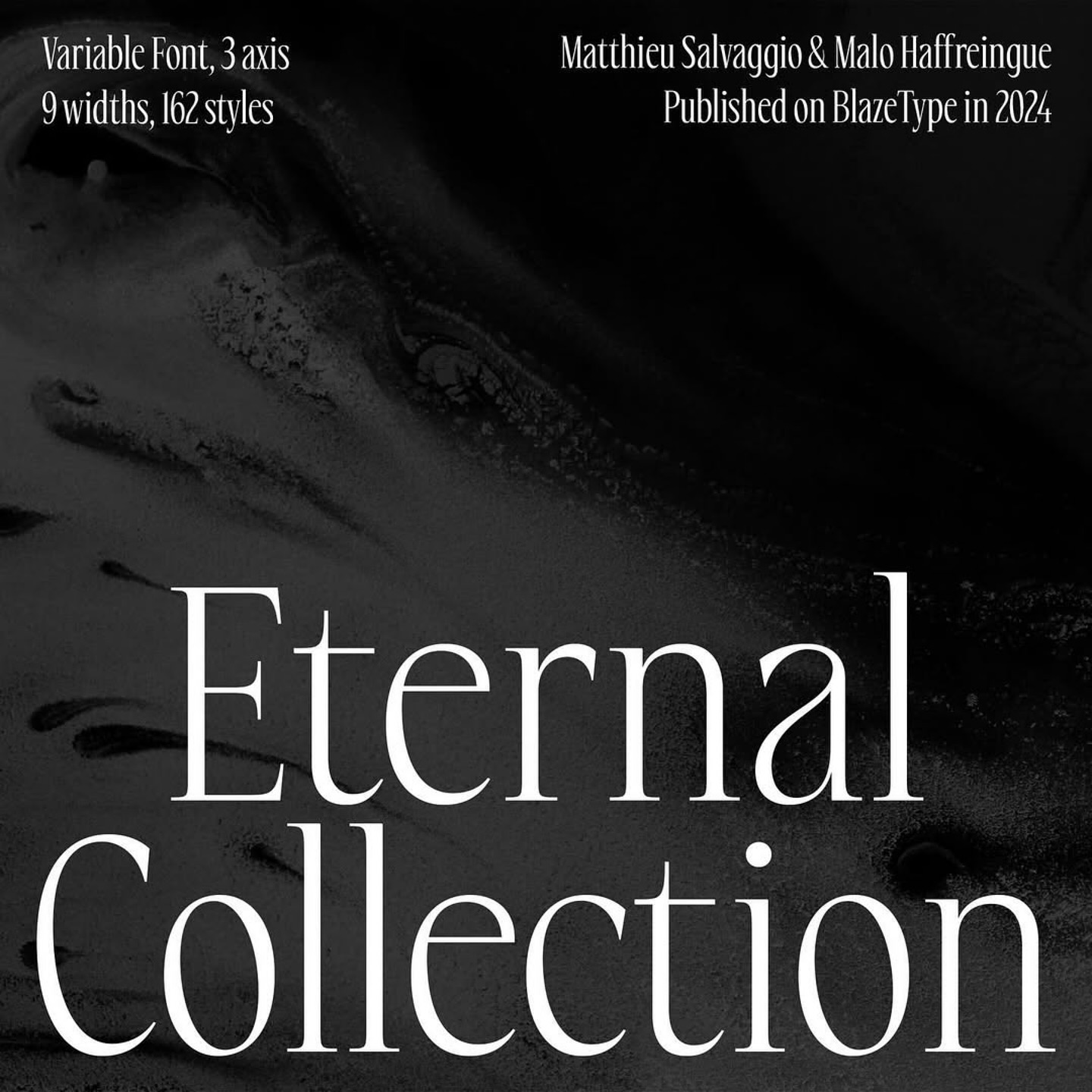
Eternal Collection is a display font family that is designed for high-impact visual communication, this font family features a striking combination of serif detailing and high contrast proportions. With an extensive range of 162 styles, Eternal Collection offers a broad range of creative possibilities. The family includes variations in width, weight, and slant, allowing for nuanced typographic expression across various design contexts. From bold, commanding headlines to delicate, refined subheadings, this font family ensures that every design element can be tailored to the precise mood and tone you wish to convey. Choose from a full spectrum of widths, from compressed to wide, and a variety of weights, from thin to black. The inclusion of slant styles adds an extra dimension of flexibility for dynamic, forward-leaning typography.

serif
blazetype
display
No preview yet

29LT Ada Round

29LT

0123456789

29LT Ada Round is a contemporary typeface inspired by the Ruqʿah Arabic calligraphic style. It is part of a larger superfamily that includes Sharp and Flat styles, making it versatile for various typographic needs. Known for its rounded, low-contrast letterforms, it is suitable for both display and body text, providing a smooth and approachable aesthetic.

display
29lt
arabic

Why a discovery engine, and not just a library

  • It spans the whole field. Major foundries, Google and Adobe fonts, and independent designers in one place, instead of one library's catalog.
  • It's ranked by people, not promotion. Votes, saves, curated lists, and real discovery activity decide what surfaces. See the ranking methodology.
  • It rewards momentum. The weekly view favors what's rising now, so you catch type before it's everywhere.
  • It works as you browse. A free browser extension helps you identify and discover fonts on any site, then save them to lists.

Frequently asked

What are the best sites to discover fonts?

It depends on the job: free libraries (Google Fonts, Fontshare) for zero-cost use, marketplaces (MyFonts, Adobe Fonts) for licensing, inspiration archives (Typewolf, Fonts In Use) for seeing type used well, and discovery engines (Typedex) for finding what's trending and distinctive now.

What makes Typedex different from Google Fonts?

Google Fonts is a free library you browse and embed. Typedex is a discovery and ranking layer across the wider font world, ranked by live community signal, so it tells you what type people are actually paying attention to.

Is there a free way to discover fonts?

Yes. Typedex is free to browse and includes a free browser extension for identifying and discovering fonts as you come across them.

Keep exploring

Font discovery toolsTrending fontsNew fontsRanking methodologyFoundry directory