0123456789
Why “Beastly”? Well, what else was I supposed to call it? Just like many of my contemporaries in font marketing, I lament the process of naming typefaces perhaps even more than the arduous task of kerning.
slab-serif
foundry
commercial
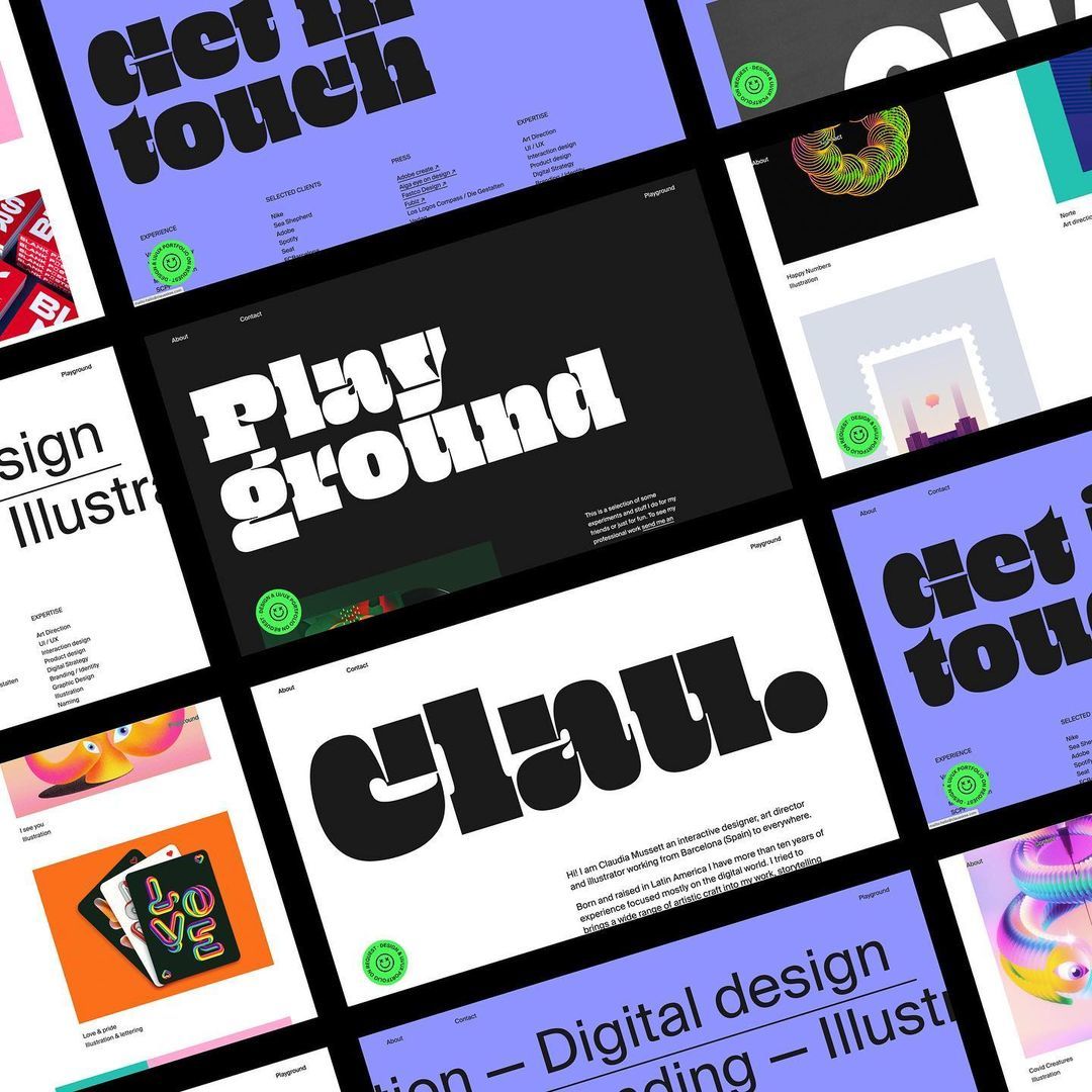
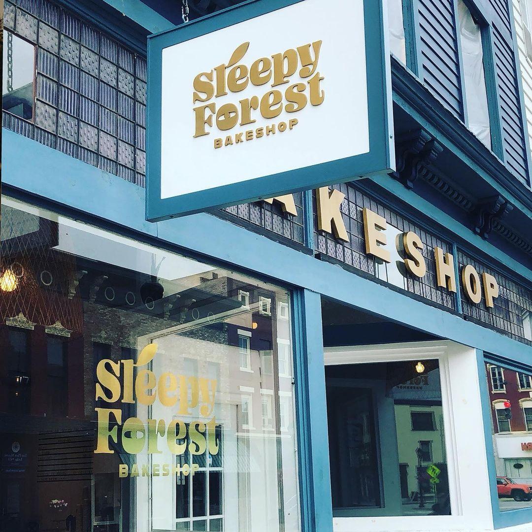
Oh No Type Co is a type foundry based in San Jose, California, specializing in both retail and custom typefaces. The foundry aims to contribute positively to the graphic and type design community.
Why “Beastly”? Well, what else was I supposed to call it? Just like many of my contemporaries in font marketing, I lament the process of naming typefaces perhaps even more than the arduous task of kerning.
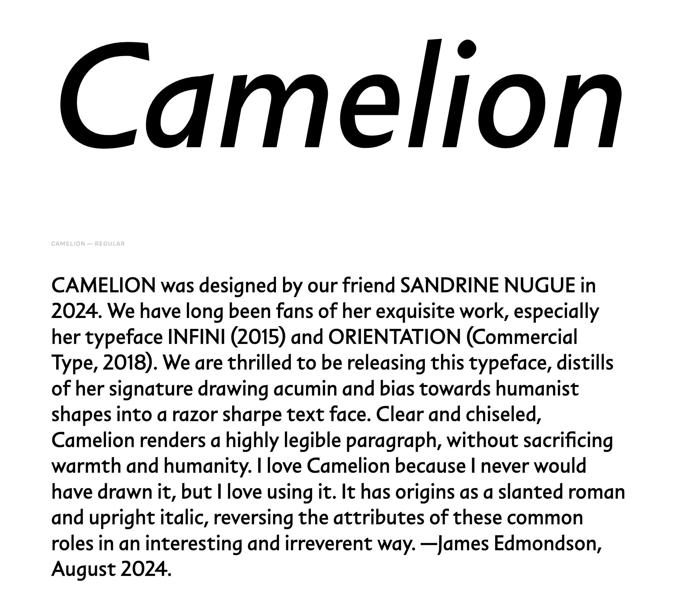
CAMELION was designed by our friend SANDRINE NUGUE in 2024. We have long been fans of her exquisite work, especially her typeface INFINI (2015) and ORIENTATION (Commercial Type, 2018). We are thrilled to be releasing this typeface, distills of her signature drawing acumin and bias towards humanist shapes into a razor sharpe text face. Clear and chiseled, Camelion renders a highly legible paragraph, without sacrificing warmth and humanity. I love Camelion because I never would have drawn it, b...
An exhaustive resusitation of Davida, the 1966 Certified Banger from Louis Minott.
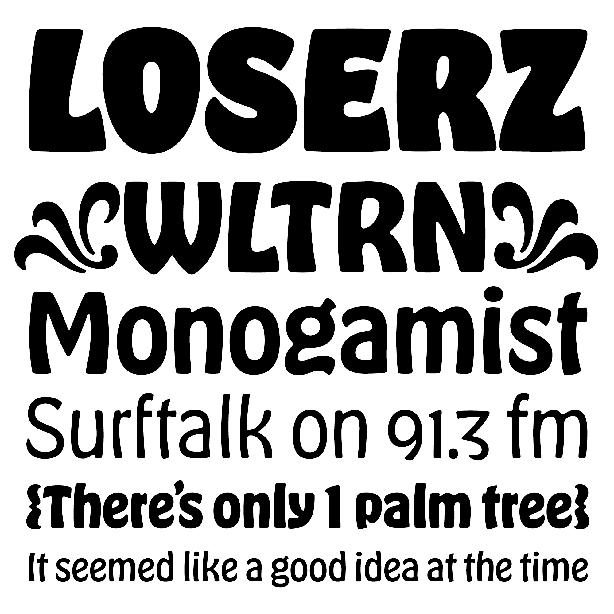
· · · · · · 25 styles of wobblin, blobblin, psychedelic goblins · · · · · ·

The Capitals-only typeface that is the glue of the entire Ohno library
Coniferous is based on the signage at American National Forests that say, “National Forest.” As a kid, on our yearly vacation to Sequoia, that routed yellow script meant we were almost there. Soon, I would be sitting at the craft shack on the lake, deep into an intense lanyard, surrounded by pine and redwood trees. This typeface is an ode to those childhood memories. ★ 6 weights, seamless connections, and a set of swash caps for spicing things up.
Covik Sans started as Covik, my graduation project in TypeMedia, a one year bootcamp for type design in The Netherlands. I was hellbent on stretching my comfort zone. I wanted to create a serif for text that would be sober compared to my explorations in expressive display type and lettering. My instructor Paul van der Laan suggested I begin there. In classic student fashion, I floundered, pivoted, and restarted in an effort to create something interesting and original.
Covik Sans is a neo-grotesque, with a dash of warmth. The seeds of this design were sprouted in James Edmondson's post-graduate studies at TypeMedia, but it wasn’t until years after graduation that it began to truly take shape. The family that results from this long and winding process has the sobriety necessary for corporate systems, but the beating heart one can always expect from Ohno.
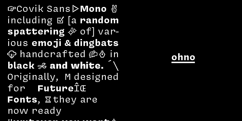
Explore Covik Sans Mono designed by James Edmondson at Adobe Fonts.
From the foundry that brought you, “Hobeaux” (2015), “Ohno™ Blazeface” (2019), and “Cheee” (2020), comes something with (significantly) less allure. While most of the fonts around here scream in desperate need of your peepers’ gaze, Degular aims to fade into the background like the finest Japanese-made white noise machine as you drift off to dreamland. Degular also provides a once-in-a-lifetime opportunity to use an Ohno font more than once! 7 weights, 3 optical sizes, in roman and italic.
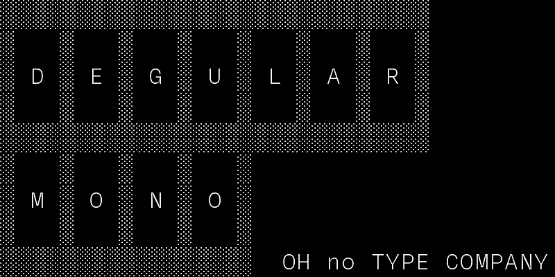
Explore Degular Mono designed by James Edmondson at Adobe Fonts.

The gastrointestinally-named typeface from the avant garde, young French type designer, Jérémy Landes of Studio Triple. The family is comprised of five widths of headline styles. A bonus “Small” optical size is included for—we’re serious about this—paragraphs. An abundant set of alternates allow for more options one would expect. Delight in the illegibility—after all, some typefaces are meant to be felt.
For a while, my psychedelia-infused version of Eckmann sat dormant on my hard drive until a friend asked for a customization with a few more letters. I was happy to oblige, and even made a little animation for a project that never got off the ground.
Is it glyphic? Incised? Classical? Call it what you want.
The original Hobo was an art-nouveau influenced design released in 1910. Over the years, this one-of-a-kind and often maligned typeface slowly degraded with each transition in type technology. In the 1980s, Hobo was one of the first typefaces digitized due mostly to its unique aesthetic and malleable voice. Unfortunately, the care taken in tracing the design left much to be desired, if only because type designers hadn't yet figured out how to best draw curves. Hobo was in desperate need of so...
IT IS NOT A MATTER OF WHETHER OR NOT THEY CAN READ IT, IT IS A MATTER OF WHETHER OR NOT THEY WANT TO.
like a ridiculous containers style, and some bizarre OpenType features

“Montreuil” is part experiment, part stalwart. It consists of these two opposing ideas with contrasting executions. First we have a Text family with the proportions, features, and quality one would expect from a world class type family.
As a lover of hand-painted signage, I have a dark side I rarely mention: I have a soft spot for vinyl too. I love to see Impact made extremely wide, and Antique Olive Nord squished to comical proportions. I love when the vinyl starts peeling up on the sides, and the corners are the only bits that manage to remain adhered to the substrate. I love the billboards for HEMPCON, TATTOOCON, and all the other CONS that advertise with black on an obnoxious shade of pink or neon green. With all those t...
Ohno Blazeface is a “real” fat fatty of a display serif. Taking a look at the (fatface) genre, I was seeing mostly the same things over and over: №1 an inability to treat problematic letters effectively, & №2 a consistently traditional structure. I was convinced a fatface could be more chill, and so Ohno Blazeface was born. ✌

Man, I didn't learn anything in art school. Psych! I learned a ton: how to critique, how to be critiqued. How to be a litigator for decisions. How every choice should be justified, logical, and systematic. And then I learned sometimes to throw all that out the window. That’s what happened with Ohno Casual.
Beginning in the (early) 1800s, the Fann Street foundry in London produced a few designs in the brand new genre of “fatfaces.” They were intended for short words to be printed HUGE, and for this purpose, they worked quite well!
When even the most rounded geometric sans is still too harsh, Ohno Softie delivers the goods. Not only is every terminal round, but every negative shape is as well, making sweet, syrupy goodness out of every word you set.
A geometric sans ready to shakeup the entire industry. What industry?