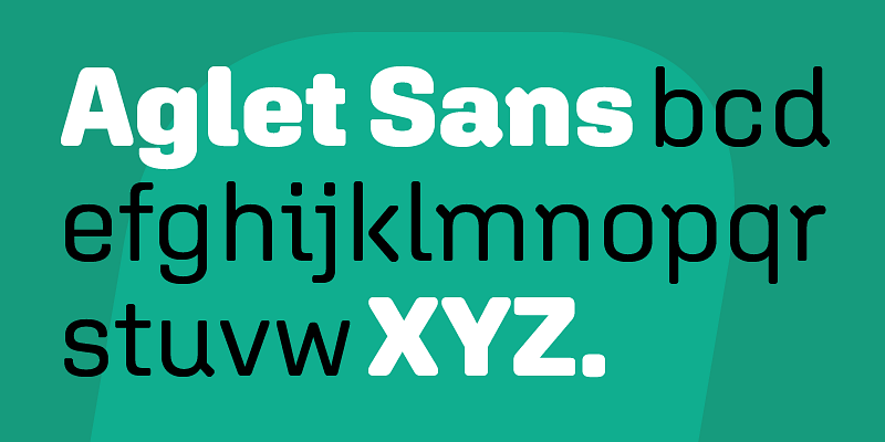
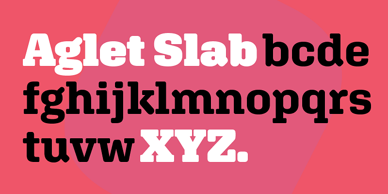
Round architecture informs Aglet Mono, tempering its rigorous, fixed-width rhythm. Clever strategies offset the lopsided spatial artifacts produced by a monospaced design: the dented sides of A, V, W, v, and w compensate for the absence of kerning. Extroverted f, j, r, and t fill their allotted space with curious hooks, and a brazen g supports the calculated weirdness of some of the other glyphs. Aglet Mono includes a set of useful symbols and comes in fourteen styles, like its relatives Aglet Slab and Aglet Sans. Minimal Extra Light resembles a wireframe of the characters, and the vocabulary of shapes grows increasingly diverse as the weights approach the bulky embrace of Ultra. A display face at heart, Aglet Mono also translates well to the more intimate, routine demands of code. Its atmosphere is distinctly industrial and technical, but also unstudied and ad hoc. Aglet Mono is a typeface for people who make stuff, whether headlines or software. -------------------- Download the PDF [here](https://xyztype.com/uploads/1100011/1595950905741/XYZ_Type_Aglet_Mono.pdf)
XYZ Type
At once technical and human, Aglet Sans explores what it means to be round, and the ways in which a system can be implemented and strategically broken. A lively mix of corner radiuses offsets strict modular structures. Interlocking entrance and exit strokes create spirited counterforms that urge the eye forward. These unorthodox details generate interest when set large, yet provide a crisp but unobtrusive voice for paragraphs and captions, both in print and on screen. Adapted from its precursor Aglet Slab, the sans has been thoroughly and sensitively redrawn to stand on its own soft feet. Used together, the two faces form a robust, flexible typographic palette of seven matched weights with true italics and an extensive set of symbols. Easily at home in editorial heads and decks, the Aglet superfamily will also add buoyant personality to corporate branding systems, interfaces, and environmental graphics. ------- Download the PDF [here](https://xyztype.com/uploads/800008/1555520724393/XYZ_Type_Aglet_Sans.pdf)
Roundness is the heart of Aglet Slab’s structure—not merely a surface detail. Blunt serifs and repeated geometric shapes find variety in a strategic hierarchy of curves, from subtly cushioned points to abrupt circular ends. An underlying framework of 45° and 90° angles provides a stable foundation for more boastful characters and organic details. Aglet Slab reverberates a friendly high-tech tone when used prominently, but it stays crisp and nimble in longer texts. A broad range of weights in roman and italic add up to fourteen versatile styles, each with matching symbols. You’ll want Aglet Slab at hand for whatever comes around the corner. ------------------- Download the PDF [here](https://xyztype.com/uploads/300003/1493599113863/XYZ_Type_Aglet_Slab.pdf)
Inspired by illustrator Cecilia Carlstedt’s hand-painted script, Cortado translates the spontaneous energy of pointed brushwork into digital type. With a strikingly fresh aesthetic, Cortado has breezy confidence and mid-century cool. To mimic hand lettering, nimble OpenType programming automatically alternates cursive connections with breaks between characters. Ligatures step in to prevent awkward collisions, and words end in natural brushstrokes. Repeated letters have subtle shape variations, for an authentic, self-assured feel. You can fine-tune every feature yourself, but why not let Cortado do the heavy lifting? Kick back with a café cortado (the Spanish name for espresso cut with milk). Cortado’s got this—with fully-caffeinated swagger. ------ Download the PDF [here](https://xyztype.com/uploads/300003/1493599113232/XYZ_Type_Cortado.pdf)
While walking around New York City one day, Jesse Ragan happened upon a string of unconventional letters bluntly printed on the side of a cardboard shipping box from a hand-carved flexo plate. The letters’ original creator is unknown, but Jesse decided to pay homage to the unpretentious forms via an all-caps typeface, in Regular and Stencil versions, that preserves the brawn and bite of its analog inspiration. A system of bulges and pinches underlies Export’s irreverent internal logic. Rough edges lend a soft finish to the face’s blocky heft. Eccentric shapes command attention when isolated, but an industrial rhythm takes hold in chunks of text. Export Stencil turns the playful concept of the original on its side, with a network of breaks that are at once pragmatic and illogical. Although a collection of shipping caution symbols are enclosed, this is one durable package. -------- Download the PDF [here](https://xyztype.com/uploads/300003/1493599113462/XYZ_Type_Export.pdf)


