When two roads diverge in a wood, Auger Mono takes both. An array of alternates gives it unusual stylistic flexibility for a fixed-width typeface, ranging from plain and practical to aggressively geometric. Influences include old Leroy lettering templates, Fortunato Depero’s Bolted Book, and classic grotesk jobbing faces.
Signal Type Foundry
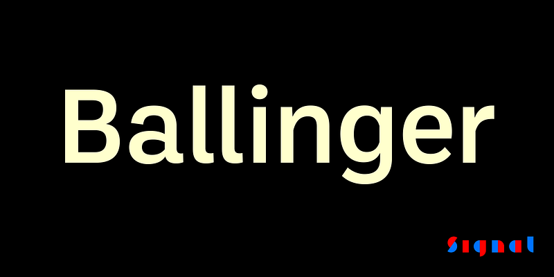
Ballinger is a plain, simple tool for clear communication. It includes eight weights with matching italics, plus condensed and monospaced versions. Letters like a, e, and s open out gradually as they move from Thin to Black. Italics incorporate subtle ogee curves to lend warmth and energy to the page or screen. Supports Cyrillic and Vietnamese. Also available in Condensed, X-Condensed, and monospaced versions.
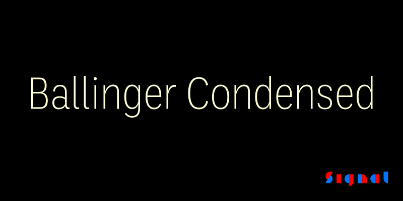
While Ballinger's eight Condensed styles are designed for impact, we took care to balance them for continuous reading, making them ideal for applications where space is at a premium. Features include semi-oldstyle figures and case-sensitive punctuation and delimiters. Also available in full-width, extra-condensed, and monospaced versions.
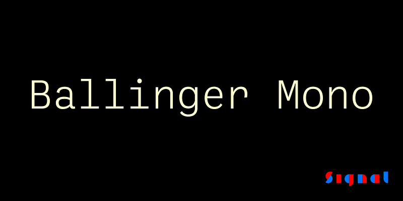
Ballinger Mono is designed on the same principles as its sister face Ballinger: plain, sturdy forms with large counters, open apertures, deep junctures, and a generous x-height. It matches Ballinger’s eight weights, which makes it unusually versatile for a fixed-width face, and has been carefully rebalanced for ease of reading. Ballinger is also available in proportional, condensed, and extra-Condensed versions.
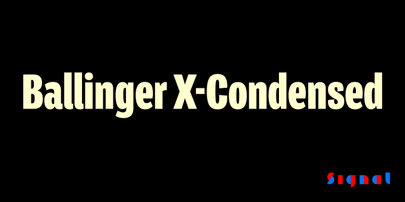
Their ancestral DNA is visible in the generous counters and x-height, forthright forms, and air of cheery efficiency. But the radically smooshed X-Condensed styles are ideal for movie credits, legal disclaimers, and lists of side effects. Features include semi-oldstyle figures and case-sensitive punctuation and delimiters. Also available in full-width, condensed, and monospaced versions.
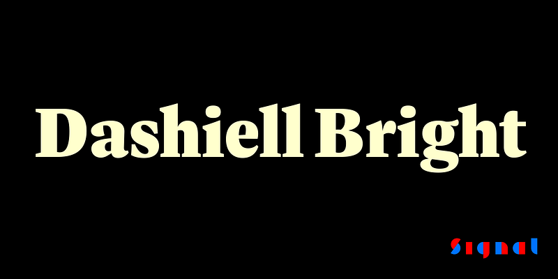
Dashiell Bright has more sparkle than Dashiell Text, with subtly finer hairlines and serifs, and is particularly suited to printed books and magazines, where its crisply drawn forms hold the page nicely without being overbearing. While a touch more literary than Dashiell Text, it shares the same six weights, ample counters and x-height, and unbracketed wedge serifs.
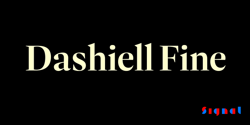
The dramatic contrast and wiry hairlines of Dashiell Fine are best at large sizes, where its bladelike serifs and Caslon-derived forms give it a hard-edged, Didonesque elegance. Its seven weights include an additional Light style for especially delicate work; its Black weight provides a touch of swagger.
Dashiell was made to be Designed by a devoted reader with lousy eyesight, it’s an attempt to combine the warmth and frankness of Caslon with the lucid elegance of Garamond. It includes proportional and tabular lining and oldstyle figures, small caps, case-sensitive punctuation and delimiters, and a selection of borders and ornaments.
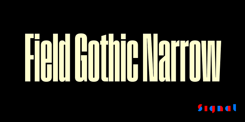
Explore Field Gothic Narrow designed by Max Phillips at Adobe Fonts.
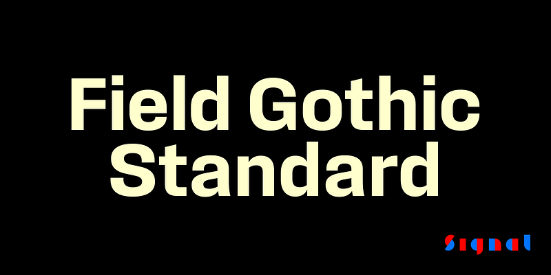
Explore Field Gothic Standard designed by Max Phillips at Adobe Fonts.
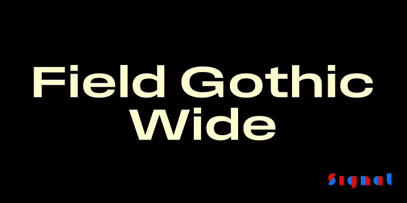
Explore Field Gothic Wide designed by Max Phillips at Adobe Fonts.
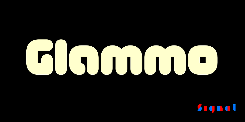
Explore Glammo designed by Max Phillips at Adobe Fonts.
Kōsetsu (Japanese for ‘snowfall’) is an exercise in restraint, a grid-based all-caps modular typeface assembled from a single isosceles right triangle. Its blocky, angular forms reference both broad-nibbed calligraphy and 8-bit video games. Letters vary in height, creating a syncopated rhythm which users can control with a set of alternates.
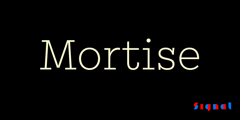
To mortise is “to join or fasten securely.” Created by an aspiring furniture-maker and an ageing typographer, Mortise is a solidly constructed new slab serif. A generous x-height, open counters, wide proportions, and monoline strokes make it readable and practical, while the long, slightly curved vertical serifs give it a raffish, mustache-twirling air.
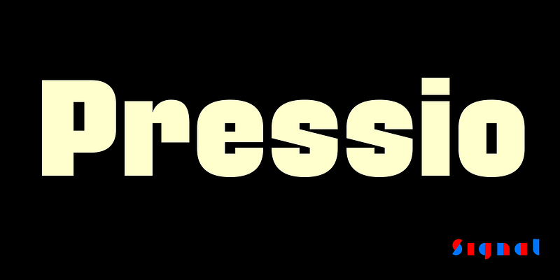
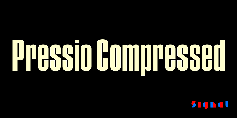
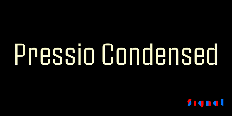
The Pressio type system is a study in doing things backwards. First, we began with the weight that’s usually drawn last: the ultra-compressed black. This was squashed down vertically in increments to make the compressed, condensed, and regular widths, then hollowed like a dugout canoe to produce the lighter weights. 20 styles in five weights and four widths provide a broad range of expression. Includes full-width, condensed, compressed, and extra-compressed versions.
The Pressio type system is a study in doing things backwards. First, we began with the weight that’s usually drawn last: the ultra-compressed black. This was squashed down vertically in increments to make the compressed, condensed, and regular widths, then hollowed like a dugout canoe to produce the lighter weights. 20 styles in five weights and four widths provide a broad range of expression. Includes full-width, condensed, compressed, and extra-compressed versions.
The Pressio type system is a study in doing things backwards. First, we began with the weight that’s usually drawn last: the ultra-compressed black. This was squashed down vertically in increments to make the compressed, condensed, and regular widths, then hollowed like a dugout canoe to produce the lighter weights. 20 styles in five weights and four widths provide a broad range of expression. Includes full-width, condensed, compressed, and extra-compressed versions.
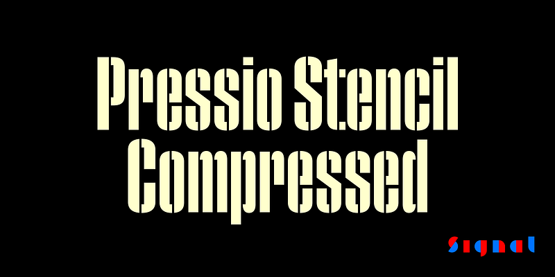
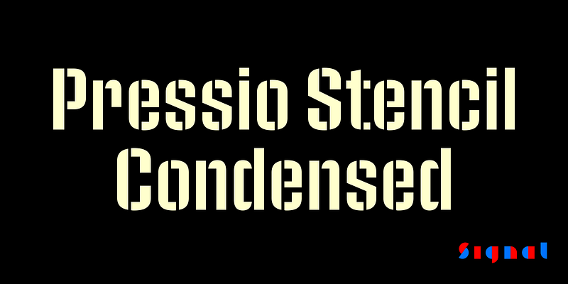
Pressio Stencil brings Pressio’s square counters and superelliptical curves to the stencil genre. The result is Mid-century Modern with a touch of packing crate. Like its solid sister, it includes a set of stylistic alternates to round off some of the unexpectedly sharp corners of letters like S, s, and a.
Pressio Stencil brings Pressio’s square counters and superelliptical curves to the stencil genre. The result is Mid-century Modern with a touch of packing crate. Like its solid sister, it includes a set of stylistic alternates to round off some of the unexpectedly sharp corners of letters like S, s, and a.
The Pressio type system is a study in doing things backwards. First, we began with the weight that’s usually drawn last: the ultra-compressed black. This was squashed down vertically in increments to make the compressed, condensed, and regular widths, then hollowed like a dugout canoe to produce the lighter weights. 20 styles in five weights and four widths provide a broad range of expression. Includes full-width, condensed, compressed, and extra-compressed versions.
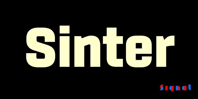
Sinter is the sharp-elbowed sister of our best-selling Center: crisper and more assertive, but with the same open counters, forthright curves, and squarish rounds as its sibling. Its look is less futuristic but more businesslike, and its hard-edged clarity lends firmness and confidence to the page or screen.

