Shinntype

17 fonts
Aptly

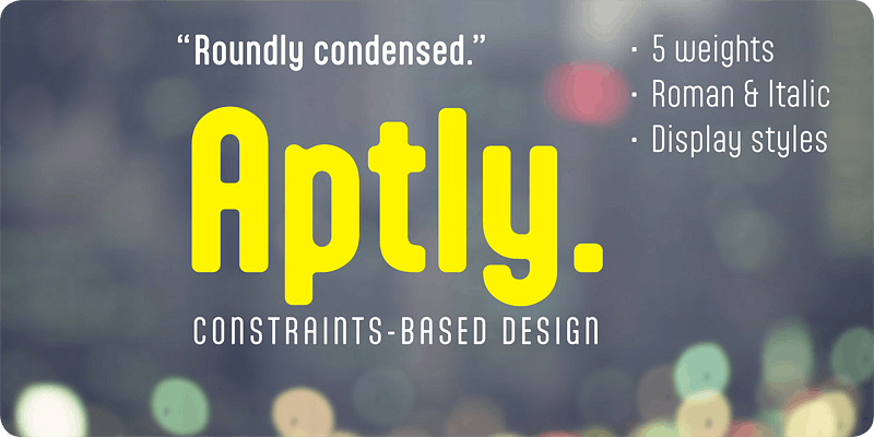
A liminal work, Aptly focuses on the condition in which humanity may be expressed under the normalizing constraints of technocratic systems. To this end, Aptly’s design space is posited as an array of severe constraints which demand an aesthetic resolution. The resolving concept is “Geo-Soft”, characters being constructed almost entirely from arcs of circle connected by or-thogonal straight lines, with few diagonals and nary a sharp corner—as if words are being routed by a bit of fixed dimension. The effect has an engaging tension, with soft edges offsetting rigorous structure, as if words are simultaneously melting and compiling. Working this conceptual tem-plate, Shinn fashions a cool, elemental and timeless repose.

sans-serif
rounded
geometric
Beaufort Pro

Engaging the issue of scalability, Beaufort® configures vectors for serifs of extreme sharpness—independent of type size, limited only by device resolution. Scale of effect confronts the typographer with a design axis stretching from awesomely huge to preciously tiny. How big is enough?

serif
foundry
commercial
Bodoni Egyptian Pro

Beneath the dominant signifier of identity, a surprising dimension of Bodoni is revealed—its core architecture, stripped of the famous high contrast cloak. Further subverting typographic norms, a monoline of even width (in all but the heaviest weights) here describes capitals, lower case, small caps and serifs. And yet a certain quaintness is evident; Bodoni Egyptian® is, after all, both deconstruction and historical fiction.

slab-serif
foundry
commercial
Brown Pro

In the Post-modern view, formalism was symbolic of function more than the result of it, and this is certainly true of modernist types—prompting a reconsideration of the reductive notion of functionality espoused by 20th century sans-serifs. In Brown, functional complexity engenders a gently stylized distress (signifying the trace of letterpress process from which the neo-grotesque types were by no means immune), pre-empting the dulling action of offset printing at text size, while providing the otherwise austere form of headlines with the visual interest of display details.

sans-serif
foundry
commercial
Dair

A meticulous restoration of the first Canadian-designed roman typeface, which was completed by Carl Dair in 1967 and named after 16th century explorer Jacques Cartier. The typeface is characterized by ascenders which tower dramatically above the capitals, by condensed italic minuscules inclined at a mere 6 degrees—and by its profound empathy for the core principles of the roman type form, originating over 500 years ago.

serif
foundry
commercial
Duffy Script

An interpretation of the lettering of contemporary Toronto illustrator Amanda Duffy. Each weight contains four glyphs for every character (including all numbers, punctuation and symbols). These are coded to set in a non-repetitive order, for a subtle, pleasantly natural effect—and this is generally what is meant by “pseudo-random” in OpenType fonts. The variant glyphs for each character are not radically different, but consistent in the way that letters from Duffy’s hand exhibit slight modulations from a distinctive pattern. While casual script fonts without a pseudo-random feature may be used to signify certain values, fonts with it go a step further in analogue simulation, reproducing the experience of reading hand lettering.

script
foundry
commercial
Figgins Sans

To meet the burgeoning demands of commerce, type founders in 1830s London introduced a plethora of new fonts which abandoned the traditional nib-informed model. Most radical were bold, capital-only designs with almost no stroke contrast, stripped bare of serifs. To all intents and purposes (except perhaps their allusion to primitive culture) these minimal expressions of utility were identical to 20th century functionalism. Recontextualizing one of the original sans fonts, Shinn offers an alternative proposition to the myth of modernism.

sans-serif
foundry
commercial
Gambado

‘Bounced’ is the technical term for a higgledy-piggledy style of lettering in which characters are shaken up by a combination of rotation and vertical displacement from the presumed norm of upright stance on a baseline. Now, by utilizing pseudo-random contextuality in the OpenType format, Gambado creates complex, default bouncing automatically through the agency of a font, rather than letter-by-letter manu-al adjustments at the level of layout.

serif
foundry
commercial
Goodchild Pro

Goodchild is a pragmatic Jenson revival, equipped for complex academic work. The face has a large x-height, as there is little point in adding to the stock of rangy “book” Jensons. Despite this departure from the archetype, in other respects Goodchild is true to the original letter forms in its tight fit, modulation of stroke contrast, and manipulation of x-height and serif size. Jenson’s tiny tittles and diamond-shaped periods have, however, been relinquished. The finish is not the antiquing that one often finds in Renaissance revivals. Here clean, decisive details provide a freshly minted, contemporary appearance, providing a smart impression should one wish to use the face at display size.

serif
foundry
commercial
Handsome Pro

The digital font as biomimetic software, making robot writing that disguises its artifice behind a shifting cast of character alternates. In parroting the joining rules of cursive script Handsome holds a mirror to pen culture, revealing an affinity between the systematic structure of formal writing systems and the programmed logic of advanced digital typography.

script
foundry
commercial
Naiad

A neoclassical fancy, questioning the convention that decoration is a superficial veneer of style. Here, ornament and function are combined in flourishes integral to the structure of (almost) every glyph. Much Victorian display type had a similar goal, to move beyond ornament as surface and through force of ingenuity embed it into the deep structure of letter forms.

serif
foundry
commercial
Nicholas

Meticulously drawn and kerned for the classic Tight-But-Not-Touching style of display typography, Nicholas has alternate characters that improve fit automatically. The overall effect is quite distinct from and superior to ‘optical’ kerning or mere negative tracking. Nicholas is the display version of Goodchild, Shinntype’s Jenson revival.

display
foundry
commercial
Panoptica

Monowidth, unicase: the alphabet imprisoned in cell blocks. With current concern over surveillance and identity as backdrop, Shinn suggests that there are no exemptions, the universality of this proposal indicated by the diversity of genres to which the Panoptic effect has been applied.

slab-serif
foundry
commercial
Paradigm Pro

The first truly roman type (by Sweynheym and Pannartz, 1468) had large serifs on the upper case letters, but almost none on the lower case. The treatment of the cases was soon afterwards integrated, with serifs prevailing for the next 350 years. Here Shinn beats the path untrod, switching the emphasis to imagine a Venetian old style face of low contrast and vestigial serifs, confronting our awareness of what was with what might have been, sowing confusion between the two—a subversive construct pointing to the state of flux in which cultural authenticity exists.

serif
foundry
commercial
Parity Sans

Originally conceived as a unique experiment (monowidth + unicase), Parity Sans has been expanded to include proportional fonts. Exceptionally for a unicase design, the extensive family enables complex hierarchies of functionality, with italics, six weights, and text and display styles.

sans-serif
foundry
commercial
Richler Pro PE

Commissioned in memory of author Mordecai Richler, this typeface takes its cue from the ingenious postmodern tour de force that is his novel Barney’s Version, fusing present-day structure with traditional skill. Its metrical quality (the steady rhythm of vertical strokes) is derived from ‘technical’ sans serifs such as DIN, producing an even measure unusual in a serifed type, facilitating legibility down to the smallest sizes.

serif
foundry
commercial
Scotch Modern

Recontextualizing the 10-point type of a scientific report published in 1873, Shinn has produced sleekly refined, micro-detailed vector drawings by eye, without the usual reliance upon scans and tracing—the result is uniquely authentic. With optical sizes, copious OpenType features and extensive language coverage, this Scotch is quite magnificent.

serif
foundry
commercial