Overlap Type

4 fonts
Boiga

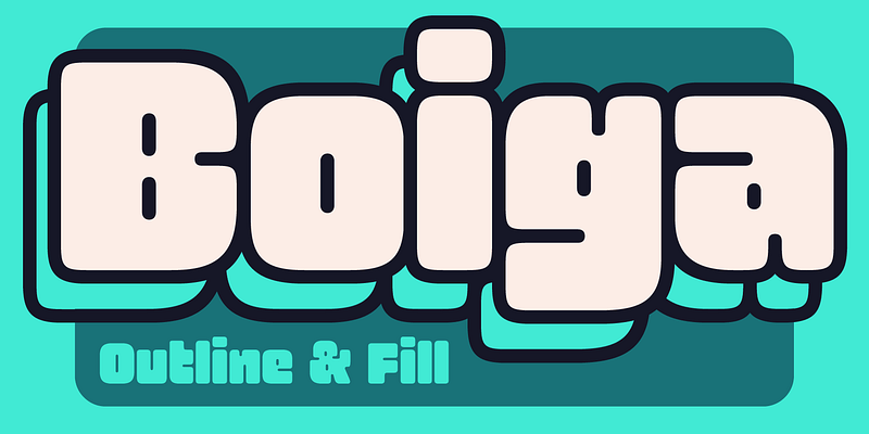
Boiga is a display type family by Kel Troughton. It’s soft edges, bulky joins and overlapping outlines make it a great headline style for any design looking to add some friendly quirk. The family was drawn to work as an outline with uniform overlaps but also contains the filled in version of the letters. Boiga’s shapes come from two very different sources. The first is bold signage and packaging from Amayoko shopping district in Tokyo, ultra-bold, often outlined type in bright colors. The second source is 1990s New York rooftop graffiti, specifically two letter throw ups that are bold enough to Both sources rely on an often friendly and cute demeanor in a sometimes anthropomorphic letter. The name Boiga references two subjects: 1: A snake with sectional body markings that is kinda cute. 2: A goofy way to say the word Burger.

display
foundry
commercial
Forager

Forager is the culmination of a deep love for display fonts, nature, and psychedelic rock. It combines the design aesthetics of the 70s, the flow of Art Nouveau, and the simplicity of sans serifs into an overlapping typeface. The typeface has a combination of bowed verticals and flat horizontals that give Forager its rounded square shape which helps to improve legibility when overlapped. The family consists of five weights in both overlap, and tightly spaced styles

sans-serif
foundry
commercial
Gnar

Gnar is a bold and bottom-heavy display typeface. Its forms are influenced by the casual capitals of American sign painters, but Gnar gets its feeling from 1990s loud sports graphics. It experiments with intentional overlapping letters to maximize impact, even featuring some alternate letter shapes when needed.

display
foundry
commercial
Oaks

"Oaks is a display typeface with a friendly attitude and distinctive character. Originally developed during a school project at Type@Cooper West, it has evolved to include additional widths, accented glyphs, and refined letterforms. The design draws from sign painting traditions of the late 1800s, with particular influence from showcard lettering masters like Ross F. George and E. C. Matthews. The characteristic stem flares and overall aesthetic are tailored for vintage wall signs—the kind you'd find painted on the side of an old brick building. Oaks was born from a desire to create a design toolkit that would feel at home on the small "country grocery stores I grew up visiting in Sonoma County, California."

display
foundry
commercial