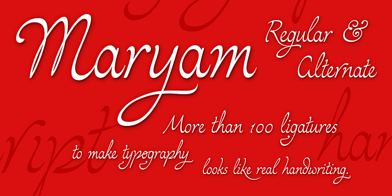
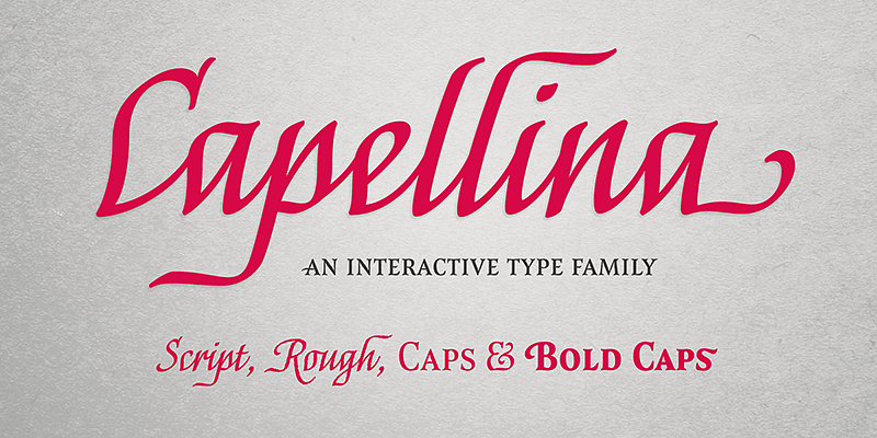
Capellina is a type family comprised of four styles – two script fonts and two small caps romans – built to work together in typographic compositions intended to catch the eye. They can be seen as some kind of lettering machines programmed to take advantage of swashes (specially at the beginning and at the end of text lines) and to avoid stroke collisions. Because of contextual alternates OpenType programming, the letters will change automatically while you’re writing. In Capellina Script and Capellina Rough you can also use the stylistic alternates / stylistic sets feature if you want to explore some extra letterforms.
Outras Fontes
Force is a contemporary sans serif ultra-black family designed by Ricardo Esteves. There are 4 font styles: Force Regular, with an upright roman structure; Force Italic, with more cursive lowercase forms; Force Shadow, that can be used alone or as a second layer to Force Regular; and Force Dingbats, containing some pictograms. Each font file has some OpenType features: discretionary ligatures, fractions, subscript and superscript. The Force family is suitable for big-size high impact situations like posters, headlines, titles, magazines, packaging and many others you may creatively think of.
Hachura is a sketchy typeface designed by Ricardo Esteves. Its general proportions are based on the garalde models, with traditional roman serifs. It was initially made by hand using a drawing technique to create a font that simulates the unfinished aspect of a work in constant progress. This textured face is useful for display sizes, making a very visible presence. Because of its basic dimensions and careful distribution of black and white, it still also very readable in text sizes like 10 or 8 points.
Jana Thork is a synthesis of stone engraved capital letterforms and uncial and half-uncial calligraphic styles. The idea of the typeface designer Ricardo Esteves was to seek for the limits between our uppercase and lowercase mental concepts. This family can be useful to compose titles, short texts, labels and letterings that need to look attractive to the eye. The family includes Regular and Bold styles, so it can be used in graphic designs that need more complex hierarchic relations or greater visual impact.
Maryam is a script type family designed by Ricardo Esteves. Because of moderate contrast, these fonts have ellegant and very legible forms even in small x-height sizes. There are more than 70 ligatures in each font, providing a lot of letterform variations that can make this type family look like real handwriting on a page.
Scrivano type family was designed by Ricardo Esteves, inspired by some handwritings from the Middle Ages and Renaissance period. The family is comprised of four elegant organic font styles (Regular, Italic, Bold & Bold Italic) that can be very useful to compose titles and short texts in graphic projects that need some 'oldstyle' feeling.


