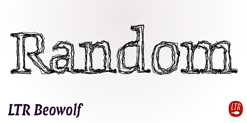
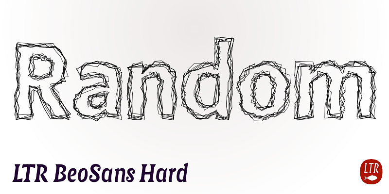
The sans serif alternative to the original Randomfont from 1989, now in a slightly tamer version. Each character in BeoSans cycles through six different iterations so the appearance is still pretty random, but it’s easier on the output device. Available in regular and bold weights, the hard and soft versions each include three degrees of jaggedness (R11, R12, R13) for a total of twelve distinct variations.
LettError
This Beowolf is a slightly tamer version of the original Randomfont from 1989 that changed its outlines each time it was printed. Letters now cycle through six different variations – your eye sees random but any output device will Jaggedness is determined by the distance the individual points have moved, and there are three versions from smoother to rougher: R21, R22 and R23.
Instantly recognizable as the voice of a nation, Federal Regular is an amalgam of massive triangular serifs and curvaceous counters. An asset to all documentation whether analog or digital, the high-contrast letters are a proclamation of fiduciary responsibility. In type we trust.
Federal Bureau is the one-stop alternative to complex layering. Enhanced with a robust bevel, the three versions differ in content: horizontal shading, diagonal shading, and no fill. The most ornate of the Federal designs in circulation on this platform, use them to add gravitas to all your documentation.
Federal Reserve Note is Federal Regular all wrapped up. Sometimes referred to as cameo or streamer, the boxed-in letterforms create eye-catching ribbons of text. Raise interest further with ten different end pieces: Crown, Toffee, Scroll, Oval, Engraved, Lunate, Crescent, Candy, Fish and Hotdog.


