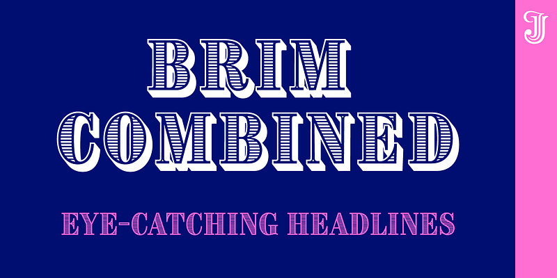
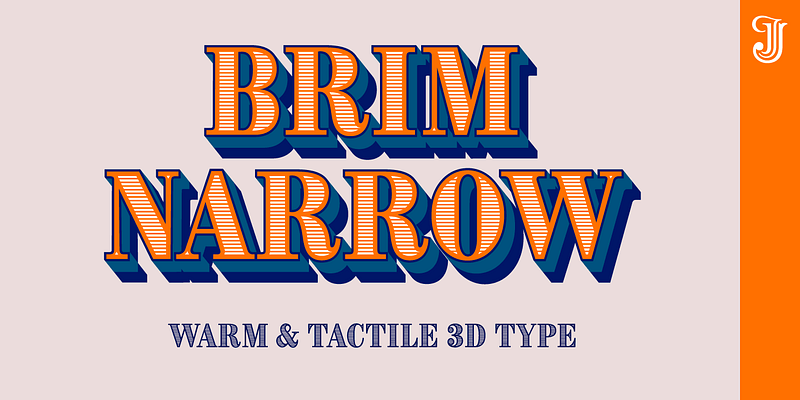
Inspired by chromatic woodtype from the 1800s, Brim Narrow’s styles stack to create a huge variety of decorative titles. Warm and tactile, it’s perfect for posters, packaging and logotypes. For additional license options like app and enterprise, please visit: [Jamie Clarke Type](http://www.jamieclarketype.com/).
Jamie Clarke Type
Brim’s innovative styles distill the warmth and tactile charm of antique woodtype into a contemporary display family. Create eye-catching headlines that invoke sophistication and heritage. For additional license options like app and enterprise, please visit: [Jamie Clarke Type](http://www.jamieclarketype.com/).
Nave is the perfect choice for designers looking to intertwine tradition with creativity. Its characters are framed by a formal, rigid outer shape, revealing an unexpected twist: a flowing, sensuous inner form. These contrasting qualities breathe life into words, inviting readers on a journey from the familiar to the extraordinary. Nave is designed for forward-thinking designers and businesses who value classic design but also want to infuse their work with personality and warmth.
Rig Sans is a streamlined geometric typeface, which speaks in a confident, affable tone. Its open, clean structure lends text a neutral, transparent quality. The generous x-height and clipped terminals of Rig Sans reinforce its robust structure. This design ensures outstanding legibility even in the most demanding environments, making it a resilient choice for varied applications. For additional license options like app and enterprise, please visit: [Jamie Clarke Type](http://www.jamieclarketype.com/).
Rig Shaded is an award-winning 3D type family with four versatile weights. Its innovative styles stack together to produce a myriad of combined effects. Choose between flat, coarse or fine shading. For additional license options like app and enterprise, please visit: [Jamie Clarke Type](http://www.jamieclarketype.com/).
An extensive range of innovative 3D fonts across four weights. Rig Solid’s striking halftone styles add texture to titles, while the sturdy filled styles add a visual punch to any typography. For additional license options like app and enterprise, please visit: [Jamie Clarke Type](http://www.jamieclarketype.com/).
Hello! I’m SideNote. I specialize in annotations, headings and friendly dialogue. I’m perfect for descriptions and explanatory text. Use me to deliver tricky information in a helpful, reassuring manner. I look friendly and relaxed but professional enough to make you look awesome. I add personality to otherwise dry information making it fun and easier to understand. Whether you’re pulling some slides together or explaining your work, think of me as your friendly assistant I come with all sorts of useful features, like emoji, arrows and underlines. [ For additional license options like app and enterprise, please visit: [Jamie Clarke Type](http://www.jamieclarketype.com/).


