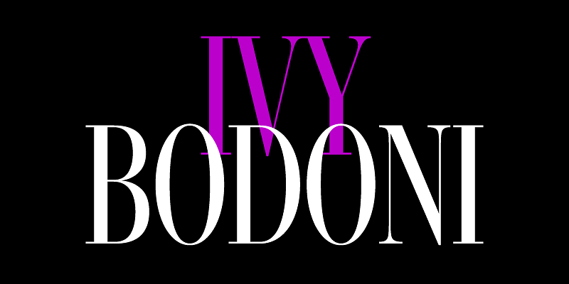
IvyBodoni is an homage to the modern serif designs of the ’60s and ’70s. Typefaces like Pistilli Roman, Didi, and CBS Didot and lettering artists such as Mortimer Leach and Tommy Thompson informed Jan Maack’s choices when drawing the crisp hairlines, distinct ball terminals, and precise curves. This 21st-century Bodoni was made for fashion and editorial design and is ready for all your display typography needs. IvyBodoni is available in 6 weights, 2 widths, plus Italic, or as 2 variable fonts.
Ivy Foundry
Explore IvyEpic designed by Jan Maack at Adobe Fonts.
IvyJournal applies the principles of both Roman inscriptional capitals and classic metal types like Bembo, Baskerville, and Times New Roman to a contemporary workhorse serif. It was originally supposed to be part of the IvyStyle type system. Throughout its development, though, Jan Maack’s vision of where he wanted to go with this style made him gradually change the design until it became a standalone family. This versatile, elegant alternative to overused text faces feels equally at home in a book, a magazine, or in the office. The Ivy Foundry, 2017. For additional license options like app and enterprise, visit Ivy Journal at [The Ivy Foundry](https://ivyfoundry.com/families/ivyjournal/).
IvyMode started out as a high-contrast companion to IvyJournal before evolving into a distinct design in its own right. Jan Maack’s new sans hints at serifs via subtly flared stroke endings and offers an extended collection of novel ligatures, alternates, and additional glyphs. Diamond dots and punctuation, pronounced contrast, extenders cut on the bias, and slightly angled stress give this face the crispness of a freshly ironed toile. The Ivy Foundry, 2018. For additional license options like app and enterprise, visit IvyMode at [The Ivy Foundry](https://ivyfoundry.com/families/ivymode/).
IvyOra is a Dutch Old Face revival produced from historical specimens found at the Museum Plantin-Moretus in Antwerpen. Mostly from a folio sheet called Proef van Letteren from the widow of Dirck Voskens issued in 1695. The sheet contains types that can be attributed to Nicolaes Briot. The Italic specimen can be attributed to Christoffel van Dijck (known in his time as the greatest punch-cutter of Old Face types in Holland). For additional license options like app and enterprise, visit IvyOra at [The Ivy Foundry](https://ivyfoundry.com/families/ivyora/).
IvyPresto is an Old Style (or Garalde) Display family based on the works of Hendrik van den Keere. The large x-height, thin serifs, hairlines, and narrow proportions makes IvyPresto ideal for Display use. An extensive range of weights and two optical sizes allows for plenty of flexibility for all your typesetting needs. The Ivy Foundry, 2020. For additional license options like app, enterprise, multi-user, and self-hosted web, visit [The Ivy Foundry](https://ivyfoundry.com/families/ivypresto/).
IvyPresto is an Old Style (or Garalde) Display family based on the works of Hendrik van den Keere. The large x-height, thin serifs, hairlines, and narrow proportions makes IvyPresto ideal for Display and headline use. An extensive range of weights and two optical sizes allows for plenty of flexibility for all your typesetting needs. The Ivy Foundry, 2020. For additional license options like app, enterprise, multi-user, and self-hosted web, visit [IvyPresto Headline at The Ivy Foundry](https://ivyfoundry.com/families/ivypresto/).
IvyPresto is an Old Style (or Garalde) Display family based on the works of Hendrik van den Keere. The large x-height, thin serifs, hairlines, and narrow proportions makes IvyPresto ideal for Display use. An extensive range of weights and two optical sizes allows for plenty of flexibility for all your typesetting needs. The Ivy Foundry, 2020. For additional license options like app, enterprise, multi-user, and self-hosted web, visit [IvyPresto Text at The Ivy Foundry](https://ivyfoundry.com/families/ivypresto/).
Jan Maack infused IvyStyle Sans’ constructed, modern look with the warm and welcoming voice of the humanist genre, and incorporated just enough quirky detail to give the typeface a unique yet unobtrusive personality. Clean lines and open apertures guarantee excellent reading comfort, while its narrow proportions save space, making it a multifunctional sans serif ideally suited for editorial design, branding, and identity work. Pair IvyStyle Sans with its sibling IvyStyle TW for harmonious sans serif / slab serif combinations. The Ivy Foundry, 2016. For additional license options like app and enterprise, visit Ivy Style Sans at [The Ivy Foundry](https://ivyfoundry.com/families/ivystyle-sans/).
While IvyStyle TW takes its cues from the typewriter genre, it is not monospaced. Because each character is allowed to occupy the space it needs, the typeface has room to breathe, and the bolder weights don’t become too dark. This contemporary slab serif with distinctive ball terminals exudes a friendly air. With more styles than normal typewriter faces, IvyStyle TW is a reliable text face. Pair IvyStyle TW with its sibling IvyStyle Sans for harmonious slab serif / sans serif combinations. The Ivy Foundry, 2016. For additional license options like app and enterprise, visit Ivy Style at [The Ivy Foundry](https://ivyfoundry.com/families/ivystyle-typewriter/).


