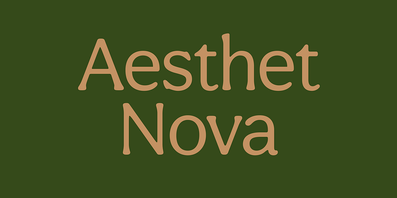
Aesthet Nova is a display type family. Released initially as Aesthet in 2015, it had a significant makeover. Inspired by the 70’s aesthetics, Aesthet Nova remains true to its original "back to nature" roots. It is a smooth talker with a larger than life personality. Equipped with an extended Cyrillic character set, it features rounded serifs, ball terminals and soft corners. Details include five weights and over 680 characters. OpenType features include inferiors, superiors, fractions and ligatures.
Inhouse Type Foundry
Calder is a display typeface collection. It incorporates 10 styles and offers two distinctive voices: a playful semi-connected script and a selection of subtle yet authentic sans serifs. Designed to complement each other, they offer a unique and engaging visual tool. Calder Script, Calder LC and Calder LC Grit, are available in both Upper and Lower case, whilst the rest of the collection is available uniquely in Upper case. Inspired by the pursuit of the outdoors, Calder began as a personal experience and endeavour to express and share the spirit of adventure connected with this renewed, growing movement.
Erbaum is a display square sans serif type family. It is straight-forward in overall structure, simple and rational in details. Erbaum was designed to maximise clarity, with an emphasis on construction and pragmatic aesthetics. The concept behind this typeface was uncompromisingly function driven, which was to provide a clear and effective medium for communication and a modern alternative to similar fonts in the aforementioned category. Extended x-height and sharp details aid legibility. Other features include seven weights, Cyrillic, alternative characters and various OpenType features.
Manofa is a calligraphic sans-serif typeface. It is inspired by Warren Chappell's Lydian and originated from the experiments with the shape and form of the letter "O". The result is a contemporary, sharp and sculptural display. Details include four weights, matching italics, two widths, alternative characters and the OpenType features.
Merel is a modern geometric typeface with humanist attributes. Geometry and logic are at the heart of this 6 weight font family. Humanist touches give it a number of distinctive characteristics, as well as aid legibility. Despite being rational and function driven in its nature, Merel has a soft and gentle touch. It was designed to tackle both print and onscreen challenges of the modern environment. Details include reduced x-height, mild stroke contrast and vertically sheared terminals with cushioned finish across the typeface. Merel features a number of alternative characters, manually edited kerning and Opentype features.
Ruddy is a display sans serif type family. It has a playful and mischievous presence. Exaggerated geometry and varied vertical character stem placement contribute to its animated appearance. Ruddy comes in 4 weights with matching italics. OpenType features include Contextual Alternates, Tabular Figures, Fractions, Numerators and Denominators.


