Fontador

10 fonts
Ador Hairline

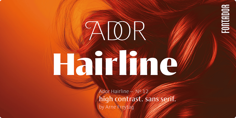
A humanist sans serif that falls in the “evil serif” genre, especially designed for contemporary typography and comes up with 7 weights from extralight to black plus true italics and 293 ligatures and initial letters. A large x-height not only creates space in the letters for extra-bold styles, but also lends Ador Hairline an open and generous character in the more narrow and semi-bold versions. The nice balance between sharp ink trapped and soft, dynamic shapes helps to work in small sizes. Diagonal stress, angled finials and the 4 degree true italic styles give Ador Hairline a dynamic look. The font contains 1,026 glyphs and a wide range of flexibility for Latin language support for every typographical need. Ador Hairline is a contemporary sans serif typeface, special for logotypes, brands, magazines, editorial, and advertising uses. Ador Hairline was on the shortlist of Communication Arts 2020.

sans-serif
humanist
sans serif
Curve

Curve is a modern neo-classical typeface family with some features of the Didone genre, but especially designed for contemporary typography. A large x-height not only creates space in the letters for extra-bold styles, but also lends Curve an open and generous character in the more narrow and semi-bold versions. It has 616 glyphs with small caps, numbers and ligatures in 10 weights. Curve is a contemporary serif typeface, special for logos, brands, magazines and editorial and for setting trends in fashion and design.

serif
foundry
commercial
Manometer

Manometer is a pneumatic ultra-black slab serif typeface. Rounded corners ease up the massive, geometric letterforms impress the reader in advertising and editorial settings.

serif
foundry
commercial
Manometer Sans

Manometer is a pneumatic ultra-black sans serif typeface with soft corners and fine counters. Turning its counters and ink traps into simple lines make the eye-catching Manometer achieve maximum.

sans-serif
foundry
commercial
Punto

Punto is not made up of grid-based dots. They are optical corrected and there is always the same distance between the dots, with the aim to create more harmonic letterforms. The dots also vary gradually in size to reflect the thickening and thinning of strokes, giving the letterforms a sophisticated overall look. Punto comes up with 3 weights and 3 italics and is perfectly suited for logos, brands, magazines and special for signage systems and mobile devices. The language support includes Western, Central and Eastern European character sets, as well as Baltic and Turkish languages.

sans-serif
foundry
commercial
Quador

Quador is a squarish serif, especially designed for contemporary typography on print and screen. The superellipse-based forms and high x-height allow large and open letterforms, perfectly adapted to the pixel grid on screen. With rounded serifs Quador provides a soft and friendly atmosphere. The font contains 6 weights from light to ultrabold plus true italics. 1,115 glyphs include 187 ligatures, small caps, tabular, old style, fractions, and a wide range of flexibility for Latin language and Cyrillic support for every typographical needs. Quador is a contemporary serif typeface, special for logotypes, brands, magazines and editorial.

serif
foundry
commercial
Quador Display

Quador Display is a serif, especially designed for contemporary typography on print and screen. The superellipse-based forms and high x-height allow large and open letterforms, perfectly adapted to the pixel grid on screen. The font contains 6 weights from light to ultrabold plus true italics. The 1,049 glyphs include 282 ligatures, tabular, old style, fractions, and a wide range of flexibility for Latin language support for every typographical needs. Quador Display is a contemporary serif typeface, special for logotypes, brands, magazines and editorial.

serif
foundry
commercial