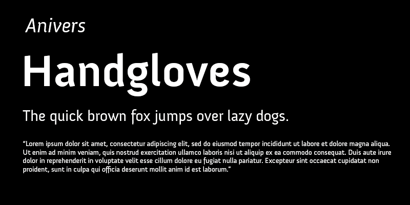
Anivers was designed to celebrate the first anniversary of Smashing Magazine. Anivers is playful and elegant but also very robust. It comes in regular, italic, bold and small caps and offers support for CE languages and even esperanto.
exljbris Font Foundry
Calluna is chunky and assertive, with exaggerated serifs. The precise lines of this serif make it a modern alternative to other old-style types. Calluna combines the charm of classic design with the clean-cut appeal of modernism.
Calluna Sans is a caracterful, humanist sans based on the popular Calluna font family. Just as Calluna it has true italics, small caps, lots of ligatures, 4 numeral sets and much more. Calluna Sans comes in 5 weights each with an italic.
Diavlo is a sharp and edgy display font family of 5 weights with lots of character. The devil is in the details, no pun intended.
Enjoy Fertigo Pro. It’s a bit like Laphroaig; they say that the more you’ll get to know it, the more you will (probably) appreciate it. Anyway … there’s just one way to give it a go.
In the process of making an italic for Fertigo Pro, I decided to make a connected script based on this. Fertigo Pro Script has extended language support, nice ornaments, ligatures and finalized forms (OpenType).
MUSEO, it all started with my love for “U”. This uppercase letter U came to me as an image in a daydream with both stems bend into semi-slab serifs. Museo is a remarkable semi-serif family with simple, open forms and highly original details.
Museo Sans is based on the well-known Museo. It is a sturdy, low contrast, geometric, highly legible sans serif typeface very well suited for any display and text use. There is also a Condensed, a Rounded and a Display family available.
Museo Slab is the slab serif version of the well known Museo font family. It’s a robust slab serif with Museo’s friendliness. If you are looking for a modern edge, but want to retain legibility and clarity, Museo Slab is a good place to start.


