Alda was designed in 2008. The original idea for Alda came from exploring an alternative approach to generating different typeface weights by adapting the characteristics of physical objects. Initially Hasebe took this treatment very literally, with the boldest weight expressing the tension of bent steel, and the lightest being as spineless as a rubber band. This allowed him to infuse each weight with unique characteristics, where the bold is robust and angular, and the light is delicate and soft. --------- ###Download the PDF [here](https://www.emigre.com/PDF/Alda.pdf)
Emigre
Backspacer was designed in 1993. Years ago, by happenstance, designers Nancy Mazzei and Brian Kelly found an old decrepit typewriter in an abandoned lot in Brooklyn. They kept it around their apartment for two years. Then one day they decided that it was time to move and they planned to throw the old typewriter away. But it was so beautiful they wanted to keep at least a part of it. They kept the keys in a brown bag until one fine day the keys were introduced to a camera. It was a match made in heaven that resulted in some beautiful quirky images of typewriter keys. These images were the inspiration for Backspacer. They were scanned, traced and turned into a working typeface by Zuzana Licko.
The Base fonts consist of three families; two families based on 12 point screen fonts (one serif and one sans serif family) named Base-12, and one family based on 9 point screen fonts named Base-9, consisting of a total of 24 individual faces. When Base was designed in 1994-95, the goal was to create a comprehensive family of screen fonts with companion printer fonts, somewhat similar in purpose to Matthew Carter’s well known typeface Verdana. In the design process of these typefaces, the screen fonts largely dictated the look of the printer fonts, rather than the other way around, because outline fonts are more flexible and are easier to adapt. For example, the proportions of the screen font determined the exact character widths within which the outline characters were adjusted to fit. Usually this process is reversed—character widths are normally adjusted to fit around the outline characters. Therefore, certain compromises had to be made, giving Base 9 & 12 a unique character reminiscent of the early computer technology era.
The lineage of Base 900 is an example of how technological restraints can serve as a source for design inspiration and exploration. The design of Base 900 morphed from a bitmap, to a restricted outline, to a full, high resolution typeface. The resulting Base 900 fonts still convey a modular, geometric style, reminiscent of the early computer technology era, but with an updated, more refined look made possible by a high resolution grid. --------- ###Download the PDF [here](https://www.emigre.com/PDF/Base900.pdf)
Base Monospace, as its name implies, belongs to a category of typefaces characterized by letter designs that each occupy a single set width, like the infamous typewriter font Courier (designed in 1956 by Howard Kettler), and the many other monospaced fonts that inspired its design --------- ###Download the PDF [here](https://www.emigre.com/PDF/BaseMono.pdf)
Explore Big Cheese designed by Bob Aufuldish, Eric Donelan at Adobe Fonts.
Explore Blockhead Illustrations designed by John Hersey at Adobe Fonts.
The inspiration for Brothers came from a bright chromolithographed letterhead designed around the turn of the century for the COLE BROTHERS traveling shows, an extravaganza of acrobatic and circus acts that included trained horses with bareback riders. There is a quality of boldness and daring in the letters that reflects the directness and bravado of circus performers. As the Brothers font series grew, Downer made several alternate capitals for the Bold, then designed a Regular weight to match in style. Next came a lower case for the Regular and a set of slightly smaller (about 90%) caps to serve the full-size Bold Caps. These have the same alternate forms found in the companion font. Finally, a pseudo-italic version of the Regular was created. It is actually more an extreme oblique than it is a legitimate italic (having fewer cursive-inspired forms than normal), hence the name “Super Slant." It has alternates that match those in the Brothers Regular Alternates fonts, and a few extras as well. --------- ###Download the PDF [here](https://www.emigre.com/PDF/BrothersAndCouncil.pdf)
Explore Cardea designed by David Cabianca at Adobe Fonts.
The Cholla typeface family was designed by Sibylle Hagmann in 1998-99 and named after a species of cactus she encountered in the Mojave Desert. Cholla was originally developed for the Art Center College of Design in Pasadena, California. There, art director Denise Gonzales Crisp and associate designer, Carla Figueroa, collaborated with Hagmann to create a series of fonts that would offer a great deal of variation. The variety was needed to echo the school's nine different departments, yet together the fonts had to exude a unified feel. It was first used in the radically designed 1999/2000 Art Center catalog which won an honorable mention in I.D. magazine and was featured in Eye No. 31. Originally Hagmann set out to design a typeface that, as she recalls, “I could feel comfortable making, first of all, and one that would serve a purpose and had a clear idea behind it, and something that I would want to use myself.” Stylistically Hagmann set out to create “12 cuts with slightly different personalities, with different ideas applied. For example the bold weight isn't simply the Regular with weight gain, but has bold letterforms with their own peculiar details. What all weights share and what is the necessary unifying detail is the tapered curve—marked out, for example, in the lowercase b’s left top and bottom of the bowl.” Gonzales adds: “The forms seemed classical as well. This combination could have a long life, and be timely. I also saw—at least in the beginnings of Cholla—forms that connoted hybrid, of inter-connection, of human and machine growing together. These notions seem appropriate for a school that teaches design and art.” ---------- ###Download the PDF [here](https://www.emigre.com/PDF/Cholla.pdf)
Explore Chowdown designed by Tucker Nichols at Adobe Fonts.
Citizen is a quirky two-weight font family for use in short texts and headlines. The design resulted from Licko’s experimentation with emerging technologies of the late 80s. With the introduction of laser printers, a “smooth” printing option was provided as a shortcut to increasing the resolution of bitmaps from screen to printer. This option processed 72 dpi bitmaps into 300 dpi bitmaps for laser printers; seemingly polishing stair step pixels into smooth diagonals. This was the inspiration for the design of Citizen. Licko used straight line segments to approximate the features of smooth printing, applied to her earlier Lo-Res Twelve bitmap design. Later, this progression would develop into the Triplex Sans family.
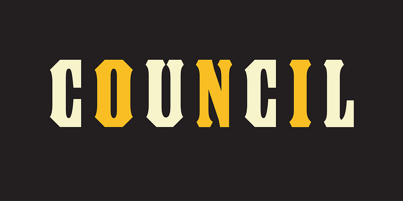
Council was inspired by the capital letters, planographically printed, on a candy tin John Downer bought at an antique store. The tin is the size and shape of a hat box, and it was made in the early 1900s for John G. Woodward & Co. of Council Bluffs, Iowa. The lettering was of interest to Downer both for its skillful design and because of its strong resemblance to wood type. The lettering was neither perfectly consistent nor slavishly executed, but it had the general look of being composed rather than drawn. Curiously, though, while this lettering style has many of the display attributes of wood type, it appears not to have been copied from any one known wood type font of its day. It is a meticulous synthesis of typographic and lithographic sensibilities. In Downer’s estimation, its dense, compact appearance seems to be the result of a commercial lettering artist’s unabashed admiration of xylographic poster types. He regards it as an example of mimicry in the best sense of the word. Downer’s work on Council began in 1996 and concluded in 1999. He tried to develop the main font with as much fidelity to the proportions of the characters on the candy tin as was reasonable while adhering to certain established typeface production standards of today. (This font is kerned, for instance.) Of the full-size capitals in the face, only those he found in the name and location on the candy tin owe their shapes to one particular source. Thus, the A, B, C, D, F, G, H, I, J, L, N, O, R, S, U, W, and & all have models. It should be mentioned that the D is unusual because it is the only letter with a convex side in this alphabet. This inconsistency exists in the original and is one Downer decided to preserve. The S, by comparison, had a squarish form he didn't favor, so he deviated from it in his font. The balance of the upper case and small caps, plus the figures, punctuation, monetary symbols and miscellaneous reference signs represent the designer’s attempt to fill out the font. The Word Logos were added later. There are no stacked letters to be seen on the candy tin, and just one raised letter, but given the narrowness of the characters in his font, Downer thought that short stacks or other arrangements of characters would be useful as a companion set. ---------- ###Download the PDF [here](https://www.emigre.com/PDF/BrothersAndCouncil.pdf)
Explore Crackly designed by Zuzana Licko at Adobe Fonts.
Explore Dalliance designed by Frank Heine at Adobe Fonts.
Designed by P. Scott Makela in 1990
Explore Dogma designed by Zuzana Licko at Adobe Fonts.
Explore Elektrix designed by Zuzana Licko at Adobe Fonts.
These six disparate fonts defy classification, or comparison, and are best explained by the following statement by Earls: “Think of these fonts as my vision induced by a string found on my table, or my Pieta, or my revolution by night. The grotesque caricature of the post World War One avant-garde, and the ennui of the Venetian-poser-skatepunk, are the tools at my disposal. Like the half-wit Karel Appel, who flung cannonballish like a circus clown at his canvas, I too paint like a barbarian in a barbaric age. I’m thoroughly disinterested in the eloquence and simulated profundity that lies between quotation marks, but for the sake of ritualized discourse, let me take a stab at it by quoting Max Ernst: ‘A painter is lost if he finds himself.’ The fact that he has succeeded in not finding himself is regarded by Ernst as his only achievement. Well played. I too cherish the suppression of logic and midnight games of Chinese checkers, but to what end? This question sweeps across my cerebellum like some medieval bubonic plague, leaving in its foul wake the stench of relativism and post-utopian thought. I’m the sad child of the lost tribe of ebola monkeys. Intellectually, environmentally and financially disenfranchised."


