Antarctican mono was designed for text on Retina displays and in print. It is an unembellished work horse that both invokes and challenges convention. Asymmetric contrast is paired with deep notches to aid legibility. Orthogonal stroke terminals lead the eye down and across. Monospaced glyphs reject the orthodoxy of evenness. A large x-height boosts the volume of the lowercase, aiding readability at small sizes, and demanding attention in display settings. Antarctican Headline is a matching family of condensed fonts. The headline fonts are proportionally spaced to allow for heavier weights than can be drawn in monospaced typefaces.
Dunwich Type Founders
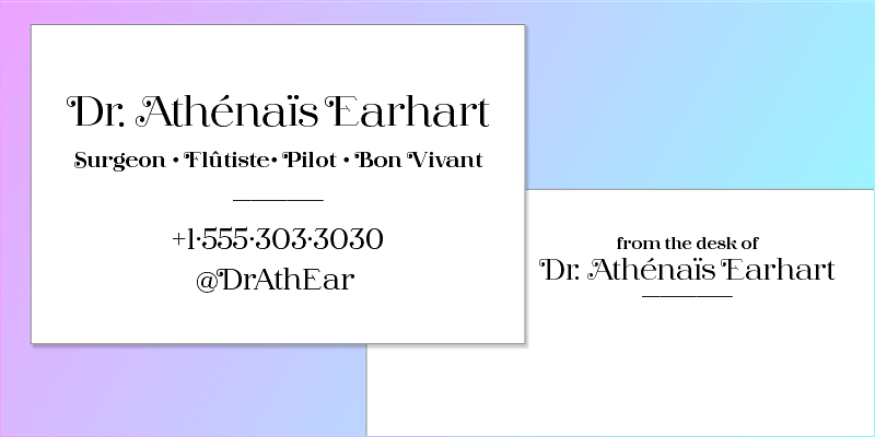
Barteldes is a striking display type family that reimagines classic American letters for the twenty-first century. Barteldes is perfectly suited to editorial, advertising, and package design. Six weights can handle a wide range of headlines. Size-specific fonts maintain hairlines in small, medium, and large sizes. Swash capitals enliven words. And an expansive character set covers over 200 languages. Barteldes is based on American architectural lettering and sign painting. Capital letters were based on architectural lettering by the Denver architectural firm Gove & Walsh and built in 1906. Lowercase letters were based on exemplars in Frank Atkinson’s classic manual “Sign Painting Up to Now”, published in 1909.
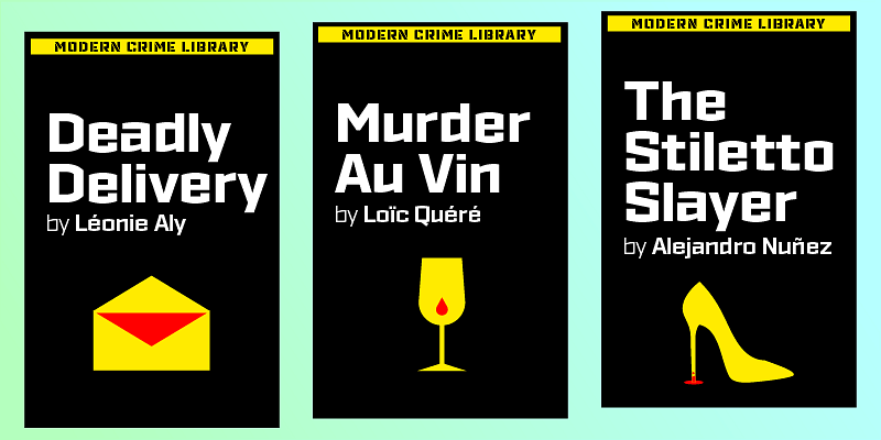
Display typefaces are usually suited to one task. A type might be perfect when a designer needs the blackest type, or the thinnest type, or the most swashes. But James Puckett wanted to design a new one-weight workhorse with lasting value. He wanted a typeface to look novel and classic, like modernist furniture. Gigalypse was conceived from a kind of superellipse known as a squircle; a square with no straight lines. As a square sans Gigalypse can look smart, serious, and even futuristic. Round corners and curved sides add warmth and humor tempered by sophisticated geometry. This soft sophistication makes Gigalypse work whenever heavy display type is called for.
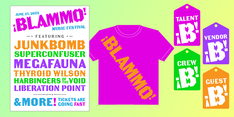
Industrial letters evoke work, strength, and ingenuity. These sturdy letters are the result of craftsmanship, materials, and the need to survive conditions that obliterate fine serifs and hairline strokes. Lettering used in Russian constructivist propaganda posters was similar. Alphabets with few curves and modular forms heralded a new era of machines and the workers who would use them. Ironstrike pays homage to industrial and constructivist lettering. Rigid shapes and tall lowercase letters evoke strength and technology. Seven weights with matching italic fonts step up to your tough design challenges. Fine light weights emphasize white space and powerful heavy weights pump up extreme headlines. An intense 17.5° italic slant makes words scream across the page. OpenType tablular figures and arbitrary fractions tackle numbers. Fourteen stencil fonts provide a full range of matching display fonts. And support for over 130 languages lets you address readers around the world. Make Ironstrike your tactical tool for commanding attention.
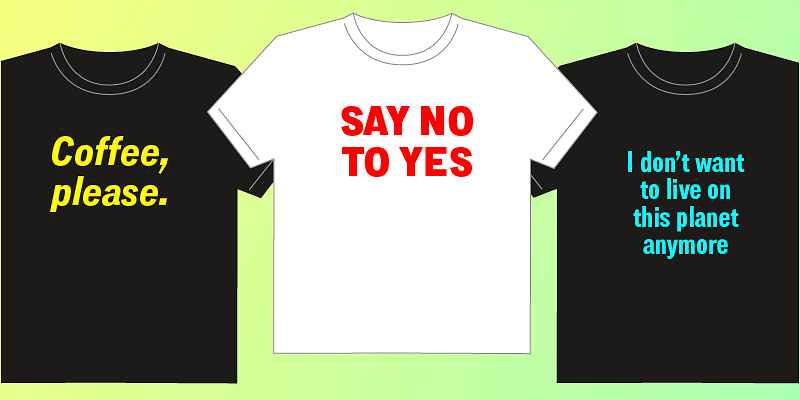
Lorimer No. 2 is not one of those 1950s sans serifs that leave personality to the copywriters. Boxy curves, slanted terminals, and a charming x-height make this sans serif anything but neutral. Narrow letters and tight spacing fit big names in tight spaces like bottles and covers. Two widths, five weights, and italics adapt to a range of tasks from from headlines to long copy. And a companion stencil font provides a matching display face.
The Becker Gothics pay homage to the nineteenth century American lettering master George Becker. Designer James Puckett has given new life to the ingenious gothic alphabets found in Becker’s 1854 lettering manual Ornamental Penmanship. Use this quintet of typographic voices to evoke vintage engraving, lithography, signs, and wood type. Each font includes 23 ornaments, and the ornaments are PUA encoded.


