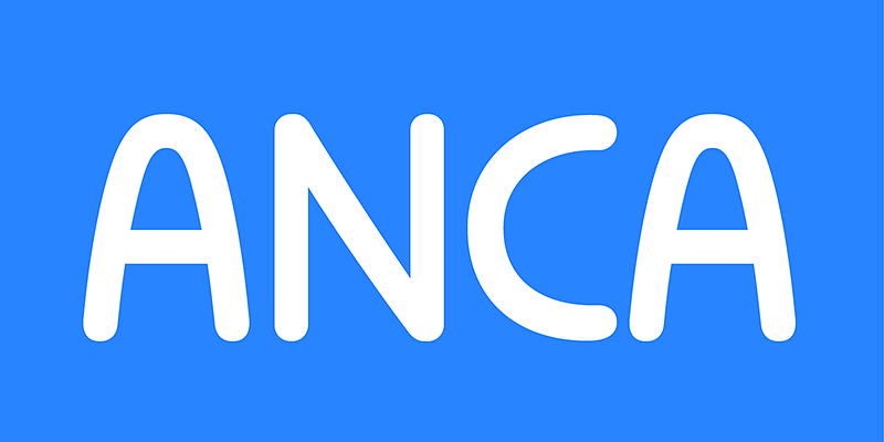
Anca typeface started as a commission work for Fest Anca, an international animation festival. They needed something to complement the corporate identity of the festival. Inspiration came from a sketch made by my friend long time ago, which had a tremendous potential. As letters were digitized and the basic alphabet was completed, a very practical and universal typeface resulted. The whole type family has a playful and simple look with rounded stroke endings as well as long ascenders. The construction skeleton uses the minimum number of strokes and as a consequence, some original letter shapes (Q, w, j, &, A, §) were produced. Despite the fact that most letter shapes are based on geometry, some strokes are intentionally irregular, which creates a very natural feeling. Anca is appropriate for setting short paragraphs, headings and big inscriptions.
DizajnDesign
Explore Deva Ideal available at Adobe Fonts.
Komu is a revival of the style of letters that was frequently used on billboards during the socialist period in the former Czechoslovakia. They were usually uppercase letters made of paper and covered with a layer of aluminum foil. People just had to pick the letters (that included a variety of widths and sizes) out of a box and pin them up on a styrofoam billboard, thus making it easy to announce any event. Komu consists of two styles. Version A is squarish and includes some distinctive characters (K, 5, narrow E, and idiosyncratic diacritics) while version B is rounded with mostly uniform widths (with the exception of E, F and L). The optical disparity of the original lettering style was retained, so that some of the characters look slightly darker than others. Komu is intended to be used on posters, books and other products about Socialism in our region and includes full support for languages based on latin script.
Explore Komu New designed by Ján Filípek at Adobe Fonts.
Poleno is a custom typeface originally designed in 2006 for the Slovak folk dance ensemble Poleno, as a part of their corporate identity. Ever since, new weights have been added to complete six variables and two different options for accents. Typeface is inspired by the woodcut book cover made by Martin Benka. The typeface adds a fresh, bold and non-rational feeling to headlines and titles in books and posters in display sizes where emphasis and detail are equally important. Randomly-generated contextual alternates included in the family contribute to add a distinctive look to words with repeating characters, whenever they occur next to each other. The difference between the Poleno Set and the Poleno Alt Set is in the accented characters. In the first one, accents are merged with the characters and in Alt version, accents are separated from the characters.
Rukou typeface originated as a logo for a fashion designer. The idea was to make a fusion of a geometric typeface with the flavour of childish features. Rukou was inspired by school hand-writing models, but adds very specific and interesting features to it. Rather than focusing on readability, the primary goal was to have a unique type texture. This is the reason why lowercase is disconnected. The disconnected letters opened the possibility to create the special shapes for individual letters. The typefaces consist of two different styles inside one font. You can choose to set your titles in uppercase, or titlecase/lowercase. As each style has a slightly different texture, there is the opportunity to combine them in interesting ways. The uppercase can even be set in small paragraphs.


