0123456789
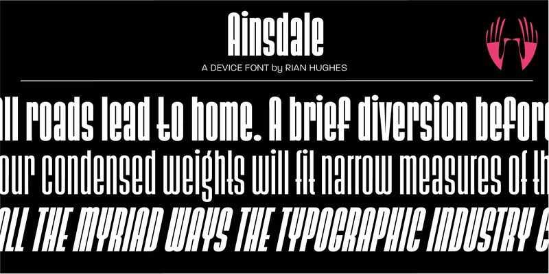
Explore Ainsdale designed by Rian Hughes at Adobe Fonts.
sans-serif
sans
pride
Explore Ainsdale designed by Rian Hughes at Adobe Fonts.
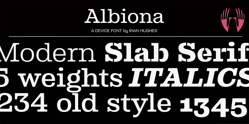
A slab-serif family with elegant inwardly-curved strokes. Includes italics, old-style and tabular numerals. A modernisation of classics such as Clarendon. Suitable for extended text and headlines.

A geometric script with linking alternates and optional swash capitals, allowing nifty customisation.

A heavy distressed stencil with urgency and grit. Best used larger, where the details can be seen.
A joyful headline face with a funky and hip flavour.
A playful balloon font that subverts traditional weight distribution. Available in shadow and highlight variants, and perfect for packaging, comics, and toys.
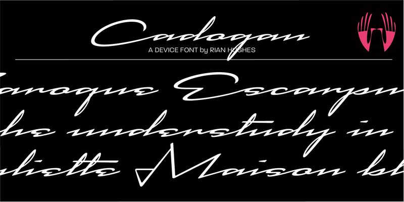
A stylish extended script that drips elegance and refinement. A hint of mid-century, but entirely contemporary.
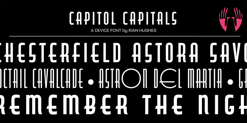
A condensed art-deco moderne font that evokes glamour and style.
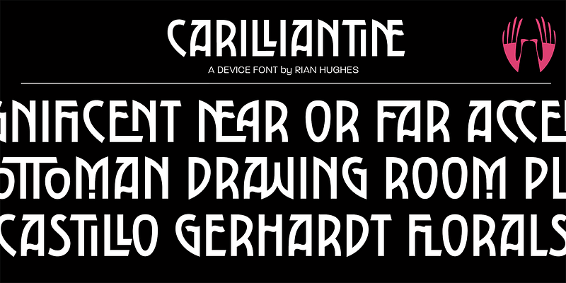
Numerous automatic ligatures mean Carilliantine gives you customised headlines right from the keyboard. These can be togged on or off in the OpenType panel.
A freely-drawn bouncy sans with character and charm. The narrow weights have elegance, the bold weights add some punch.
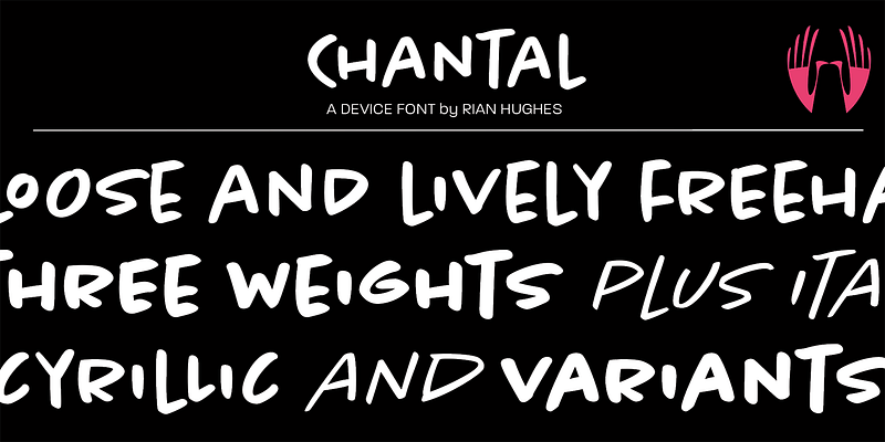
A loose, energetic freehand font. Fresh, lively and direct. Also available in Cyrillic.
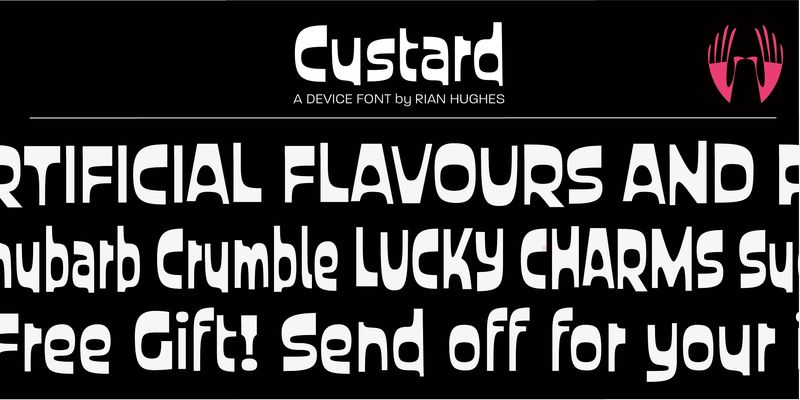
A playful sans with an obround counter and a fair degree of bounce, Custard is an ideal choice for candy wrappers, teen magazines and toy packaging.
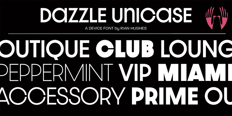
Dazzle Unicase is an elegant tight-set font with lower-case letter-forms that match the capital’s X-height, with even more available as Opentype options. Clean, sharp, stylish.
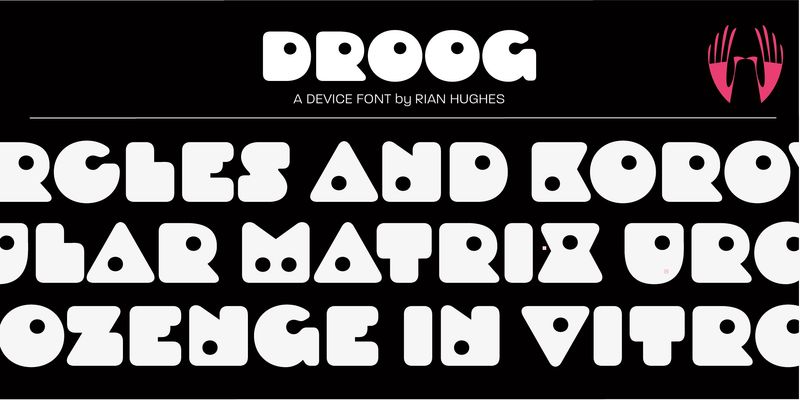
Explore Droog designed by Rian Hughes at Adobe Fonts.
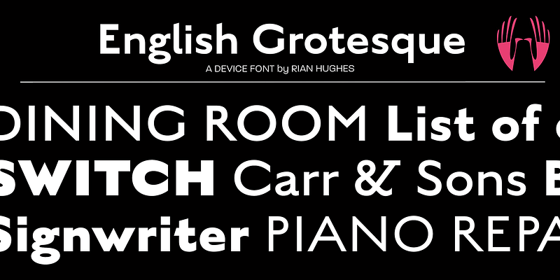
A traditional sans-serif that evokes the signwriter's art, and English styles such as Gill and Johnston.
A wide, rounded serif that is impactful, readable and friendly.
An extensive, versatile family of seven weights and three widths, plus italics. Suitable for text and headline. Includes old-style and tabular figures.
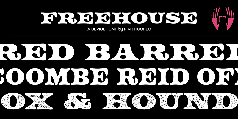
Based on vintage UK railway signage from the 20s and 30s, this caps-only font evokes elegance and tradition. The Cameo includes a selection of decorative banners, and ligatures for St, Rd, etc.
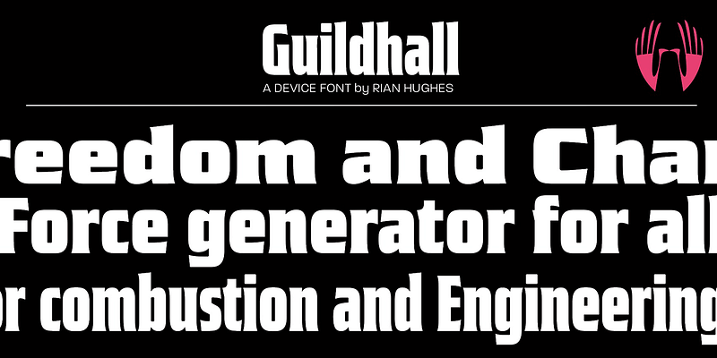
Explore Guildhall designed by Rian Hughes at Adobe Fonts.
An angular heavyweight for maximum impact. Includes a decorative inline.
A clean, business-like squared sans that combines refinement and elegance. Sharp, sleek, machine-age.

Based on an anonymous alphabet seen in photos of the Red Square Parades in the 30s, Korolev is a ruler-and-compass sans with an engineered elegance. The condensed weights and italics add up to a versatile family.
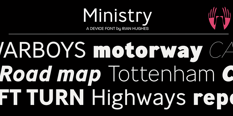
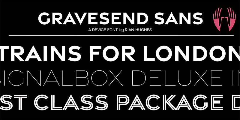
Based on the type used on British road signs from the 30s to the 60s, Ministry has an authoritative pedigree with the warmth and heritage of a traditional sans-serif.
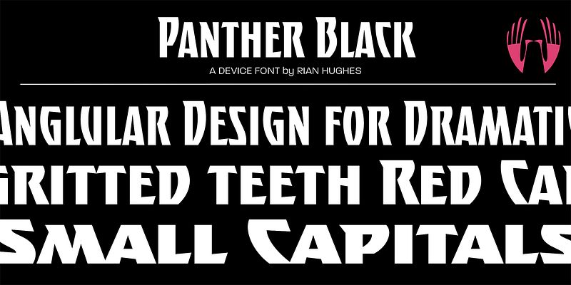
Explore Panther Black designed by Rian Hughes at Adobe Fonts.