0123456789
Explore Big Caslon designed by Matthew Carter at Adobe Fonts.
serif
foundry
commercial
Explore Big Caslon designed by Matthew Carter at Adobe Fonts.

Explore Big Moore designed by Matthew Carter at Adobe Fonts.
Explore Georgia Pro available at Adobe Fonts.
Explore Mantinia designed by Carter & Cone Type Inc. at Adobe Fonts.
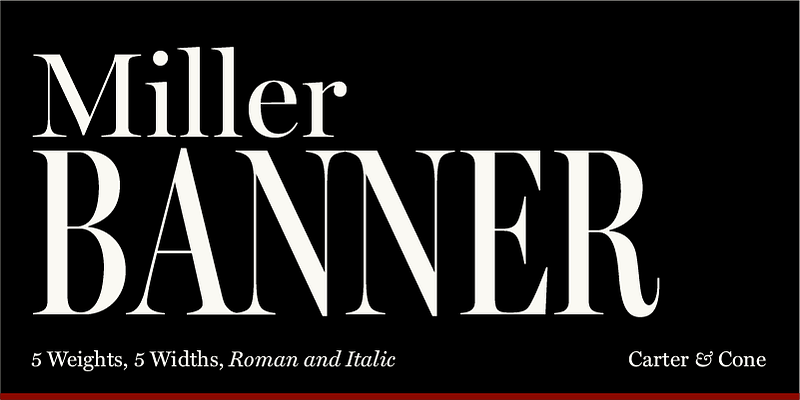
Miller Banner, the most dramatic curves within the Miller family, takes the series to new heights: 100 points and up! Matthew Carter optimized its extreme settings — hairlines sharpened, contrast sweetened — lending grace and gravitas to editorial headlines and fashion brands. Richard Lipton and Jill Pichotta of The Type Founders contributed in the expansion to give the family full range. Available in 5 widths and 5 weights, plus italics, Miller Banner has 50 styles for typographic trendsetting!
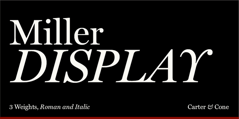
Explore Miller Display designed by Carter & Cone Type Inc. at Adobe Fonts.
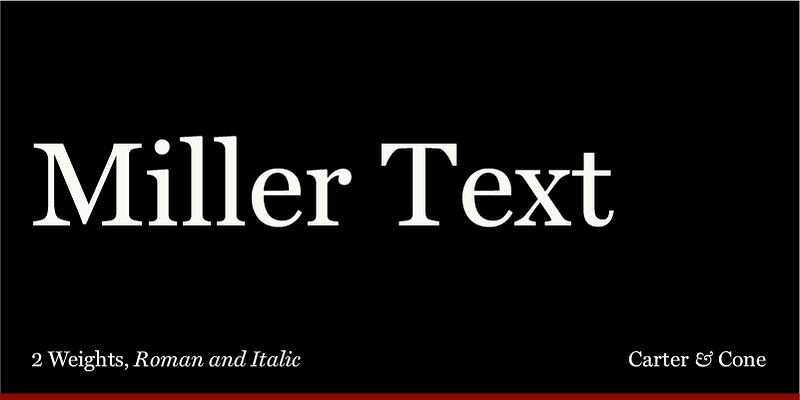
Explore Miller Text designed by Matthew Carter at Adobe Fonts.
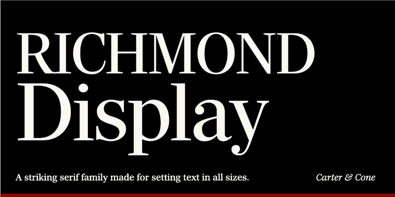
Matthew Carter’s Richmond is a striking serif family made for setting text in all sizes. Initially commissioned for a major daily British newspaper redesign, it has been expanded into a comprehensive family with contributions from Jill Pichotta and Richard Lipton of The Type Founders. The quietly assertive curves and ideal weight range offer countless means to invigorate editorial typography. Available in Display (Ultra Light to Ultra Black) and Text (Regular to Black) with matching Italics.
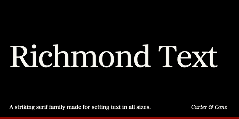
Matthew Carter’s Richmond is a striking serif family made for setting text in all sizes. Initially commissioned for a major daily British newspaper redesign, it has been expanded into a comprehensive family with contributions from Jill Pichotta and Richard Lipton of The Type Founders. The quietly assertive curves and ideal weight range offer countless means to invigorate editorial typography. Available in Display (Ultra Light to Ultra Black) and Text (Regular to Black) with matching Italics.
Explore Rocky designed by Carter & Cone Type Inc., Matthew Carter at Adobe Fonts.
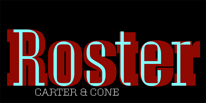
Explore Roster designed by Matthew Carter at Adobe Fonts.
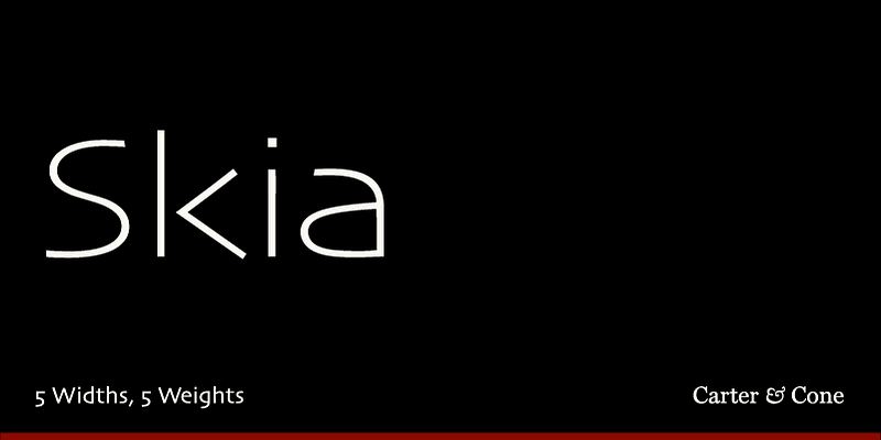
Skia CC is a humanist sans serif initially designed by Matthew Carter for Apple Computer in 1994. It was the first of the QuickDraw GX fonts and the first single font to offer variations in design. The letterforms take inspiration from 1st-century Greek stone carvings. The family has a flexible range of use because of its open counters, large x-height, and distinctly angled terminals. The Type Founders updated and re-engineered the original data and it is now available in 5 widths and 5 weights or as a single variable font.

Explore Sophia available at Adobe Fonts.