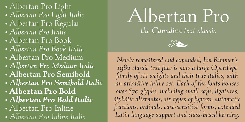
Albertan was the first Jim Rimmer typeface to make the transition from metal to digital. When the first roman face was cut at 16 pt. in 1982, it was intended for use in hand-setting limited edition books at Jim's own Pie Tree Press.
Canada Type
Bunyan Pro is synthesis of Bunyan, the last face Eric Gill designed in 1934 and Pilgrim, the machine face based on it, issued by British Linotype in the early 1950s — the most popular Gill text face in Britain until well into the 1980s.
Captain Comic is very loosely based on lettering from 1967 to the early 1970s found in the very first Star Trek comic series ever published. Most letter shapes were changed, rounded and tweaked for a more contemporary comic text look.
Clarendon Text is a contemporary remake of the truly classic slab serif typeface with a distinctively clear and legible visibility. It is a widely usable text type suited for distinction and style without sacrificing readability.
This is the wide display companion to the Clarendon Text family. It comes in ten styles: regular, medium, bold, with small caps and oldstyle figures counterparts, as well as stencil and sketch versions of the regular and the bold.
Rather than follow a particular comic book lettering model, Classic Comic’s forms are constructed with the natural tilt and wider aperture of the slightly darker lettering found in older comics on either side of the Atlantic.
Collector Comic synthesizes two different sets of letter forms: one based on old school Silver Age and Bronze Age comic books in the uppercase positions, and one with a more contemporary Modern Age spin in the lowercase cells.
Davis and its sans serif counterpart, Davis Sans, work very well together to satisfy the multiple layers of corporate, advertising and interface applications, from identity and editorial to the many levels of product branding.
Davis Sans and its slab serif counterpart, Davis, work very well together to satisfy the multiple layers of corporate, advertising and interface applications, from identity and editorial to the many levels of product branding.
This is the expanded version of what is arguably the most classic of all historic Dutch faces: S. H. de Roos’s Hollandse Mediaeval from 1912. Over the decades, many typography connoisseurs have gushed loving prose about this typeface.
Gala is a retooling and major expansion of a face called Neon, published by Nebiolo in 1935. It was one of the earliest modular faces with a clear-cut, minimal unicase construct, and inspired countless designs across three technologies.
Gibson is a sturdy contemporary humanist sans serif family that fits pretty much any design application. Available in eight weights plus italics, it has been one of the 21st century’s most widely used fonts for UX and corporate design.
Informa is a comprehensive sans serif based on traditional lettering in proportion, rhythm and stroke. It strikes a visual balance between man and machine by maintaining the equilibrium between the influences that drive the genre.
Transitional in appearance and idiosyncratic in detail, Kumlien Pro draws on the oldstyle theme but also employs a deco aesthetic in its upright weights, and uses a rare calligraphic dynamic for its stunning, almost postmodern italic.
Latex was initially a single multi-script font commissioned in 2012 to market a superhero movie. The design later grew to include a shaded variant and a set of fonts with different layering possibilities for dimensional potential.
Leather is a retooling of Imre Reiner’s 1933 Gotika design, which was very much ahead of its time. Its fragility was problematic for printers at the time, but now it seems like it was made for current grid-based technologies.
Leo is an economic magazine and book face meant for use in sizes suitable for immersive reading, with different cuts optimized for different body copy size ranges, like footnotes and legal text. Its mantra is “grace through austerity”.
This alphabet’s forms are a spin on Bifur, the all-cap deco face designed by Adolphe Mouron (known as Cassandre) in 1929. Lincoln Electric evolves Cassandre’s idea further by constructing new shapes more in line with minimalist principles rather than art deco geometry — something clearly evident in the minuscules, which exhibit a clear connection to Bauhaus ideas.
Marvin is a great cartoon font that can help you build your very own Illudium Q-36 Space Modulator, so you can trigger that earth-shattering kaboom. Then you're on your way to claim this planet in the name of Mars. Isn't it lovely, mm?
This is the retooling and expansion great German designer Georg Trump’s last oeuvre. He started working on it in 1965. Weber previewed it in 1967, but never officially published it in metal because cold type took over shortly thereafter.
Memoriam was originally commissioned by the New York Times for their 2008 “Lives They Lived” issue, which went on to win multiple design awards. Later expanded for commercial use, it has become a common sight in display and packaging.
Neil Bold was originally published in 1966 as a Typositor face. It was a jazz record packaging favorite, especially at Blue Note records, and saw regular use on science fiction book covers during the last stretch of the genre's golden age.
Orpheus Pro is rooted in two late 1920s designs by Walter Tiemann, who had an impressive talent for combining classic Roman proportions and Art Deco sensibilities. It has become a standard font in packaging and entertainment design.
Designed at Nebiolo in 1928, Paganini defies standard categorization. While it definitely is a classic foundry text face with obvious roots in the Italian Renaissance, its contrast reveals a clear underlying modern influence.


