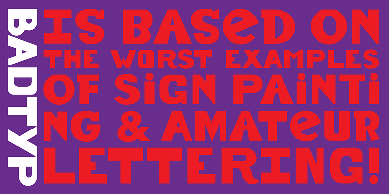
Lettering artist and graphic designer Leslie Cabarga has been charmed all his life by the eccentricities in amateur lettering, especially those found in logos and sign painting. The single font of BadTyp combines all kinds of bad combinations, cap and lowercase, thick and thin, serif and sans, to create an intriguing style radiating perverse charm and love of the naive. BadTyp was let loose upon the world by Font Bureau; FB 1993 For additional license options like app and enterprise, visit BadTyp on [Type Network](https://store.typenetwork.com/foundry/cabargatype/fonts/badtyp).
CabargaType
Leslie Cabarga’s script face Casey recalls “Casey at the Bat,” Ernest Lawrence Thayer’s vivid old baseball poem. Once, fat-bottomed scripts like Casey were everywhere, but they barely survived as logos for Campbell’s soup, Ford, Coca-Cola, and, of course, the Dodgers. In 2000, Emigre’s logo brought one back and popular use was on again. Cabarga’s splendid take on the swinging style restores it to current typographic usage; FB 2003–07 For additional license options like app and enterprise, visit Casey on [Type Network](https://store.typenetwork.com/foundry/cabargatype/fonts/casey).
Late in the seventies, Leslie Cabarga collected dynamic samples of writing from walls across New York City. He searched for common trends in style to unite the otherwise conflicting energy of the various graffiti. Set aside, the designs lay unseen for ten years until Macintosh provided the tool Cabarga wanted. He worked up this fascinating material into a single coherent typeface, Graffiti, designed for Font Bureau; FB 1993 For additional license options like app and enterprise, visit Graffiti on [Type Network](https://store.typenetwork.com/foundry/cabargatype/fonts/graffiti).
Leslie Cabarga has returned to the streamlined scripts prepared by industrial designers at mid-century for the inspiration of this Font Bureau display series. The Magneto trio recall the chrome-strip lettering laid over the rounded shapes of enameled refrigerators and automobile trunks in the ’30s and ’40s by a jaunty, self-confident American industry that knew it was going places, doing things, and changing the world; FB 1995 For additional license options like app and enterprise, visit Magneto on [Type Network](https://store.typenetwork.com/foundry/cabargatype/fonts/magneto).
Blandly glowing strings of letters in chemical colors call forth endless memories of bars and restaurants, of beer and hot dogs, of casinos on the Las Vegas Strip, the acme of neon. Gas-filled, bent-glass tubing creates the familiar letterform; even weight and deliberate curves combine oddly with wild and challenging colors that flag funky urban pleasures. Leslie Cabarga’s Neon Stream evokes the Art Deco glamour of it all; FB 1995 For additional license options like app and enterprise, visit NeonStream on [Type Network](https://store.typenetwork.com/foundry/cabargatype/fonts/neon-stream).
Leslie Cabarga’s Raceway descends from three-dimensional jig-sawn plywood letters, automatically spaced and aligned on a slotted board by the connecting stroke. Even strokes and curves combine with everpresent horizontal strokes to create a brilliant Art Deco letterform. The skillful use of the naively wide letterspacing so favored in the 1930s should guarantee this font a home in every retro-deco designer’s collection; FB 1995 For additional license options like app and enterprise, visit Raceway on [Type Network](https://store.typenetwork.com/foundry/cabargatype/fonts/raceway).
At last, an ultra-atomic connected script for the new millennium, brought to us from the 1950s by Leslie Cabarga. He based this cool font on logos from the second wave of the all-American diner, bands of stainless steel & glass spreading across the land at war’s end. Greasy fries and gas-guzzling autos may be the downside of the fabulous ’50s. He discovers the upside in the huge exuberance of these hand-lettered scripts; FB 1995 For additional license options like app, enterprise, multi-user, and self-hosted web, visit Rocket on [Type Network](https://store.typenetwork.com/foundry/cabargatype/fonts/rocket).
Saber began with a “lowercase,” a series of blackletter, uncial and celtic forms that appeared to Leslie Cabarga in a designer’s dream. From these illusory nocturnal images, a wide awake Cabarga dreamed up extravagant orgies of capitals, highly original forms hinting at past Victorian frenzies, establishing beyond any shadow of doubt that “nothing exceeds like excess.” Saber may be set entirely in lowercase, or with initial caps. For additional license options like app and enterprise, visit Saber on [Type Network](https://store.typenetwork.com/foundry/cabargatype/fonts/saber).


