Blackletra

15 fonts
Elizeth

Elizeth is the seriffed counterpart to Ofelia. It is a very versatile typeface in two widths and seven weights, to be used in a great variety of situations. The normal width is a geometric slab which evokes early XX century rationalism — establishing dialogue with typefaces such as Rockwell — however using bracketed serifs. The typeface offers true italics, broad language support and a sort of OpenType features such as Small Capitals, old style and tabular figures.

slab-serif
foundry
commercial
Elizeth Condensed

Elizeth is the seriffed counterpart to Ofelia. It is a very versatile typeface in two widths and seven weights, to be used in a great variety of situations. The normal width is a geometric slab which evokes early XX century rationalism — establishing dialogue with typefaces such as Rockwell — however using bracketed serifs. The typeface offers true italics, broad language support and a sort of OpenType features such as Small Capitals, old style and tabular figures.

slab-serif
foundry
commercial
Elza

Elza is a typeface who responds to the intention of creating a type family without any personal traits or distinguishable features. The font offers oblique versions instead of true italics, and its widths are significantly more condensed than the respective Roman versions, so they stand out better when used together. It is the largest family in Blackletra's library to date, with 8 weights, 3 widths and 2 optical sizes for a total of 58 fonts. Each font has approximately 900 glyphs and offers broad language support and OpenType features like small caps, tabular and old style figures, and an alternate character to lowercase /a (one-storey). It is Blackletra's first typeface to offer a variable version with weight, width and slant axes.

sans-serif
foundry
commercial
Elza Condensed

Elza is a typeface who responds to the intention of creating a type family without any personal traits or distinguishable features. The font offers oblique versions instead of true italics, and its widths are significantly more condensed than the respective Roman versions, so they stand out better when used together. It is the largest family in Blackletra's library to date, with 8 weights, 3 widths and 2 optical sizes for a total of 58 fonts. Each font has approximately 900 glyphs and offers broad language support and OpenType features like small caps, tabular and old style figures, and an alternate character to lowercase /a (one-storey). It is Blackletra's first typeface to offer a variable version with weight, width and slant axes.

sans-serif
foundry
commercial
Elza Narrow

Elza is a typeface who responds to the intention of creating a type family without any personal traits or distinguishable features. The font offers oblique versions instead of true italics, and its widths are significantly more condensed than the respective Roman versions, so they stand out better when used together. It is the largest family in Blackletra's library to date, with 8 weights, 3 widths and 2 optical sizes for a total of 58 fonts. Each font has approximately 900 glyphs and offers broad language support and OpenType features like small caps, tabular and old style figures, and an alternate character to lowercase /a (one-storey). It is Blackletra's first typeface to offer a variable version with weight, width and slant axes.

sans-serif
foundry
commercial
Elza Text

Elza is a typeface who responds to the intention of creating a type family without any personal traits or distinguishable features. The font offers oblique versions instead of true italics, and its widths are significantly more condensed than the respective Roman versions, so they stand out better when used together. It is the largest family in Blackletra's library to date, with 8 weights, 3 widths and 2 optical sizes for a total of 58 fonts. Each font has approximately 900 glyphs and offers broad language support and OpenType features like small caps, tabular and old style figures, and an alternate character to lowercase /a (one-storey). It is Blackletra's first typeface to offer a variable version with weight, width and slant axes.

sans-serif
foundry
commercial
Gandur New

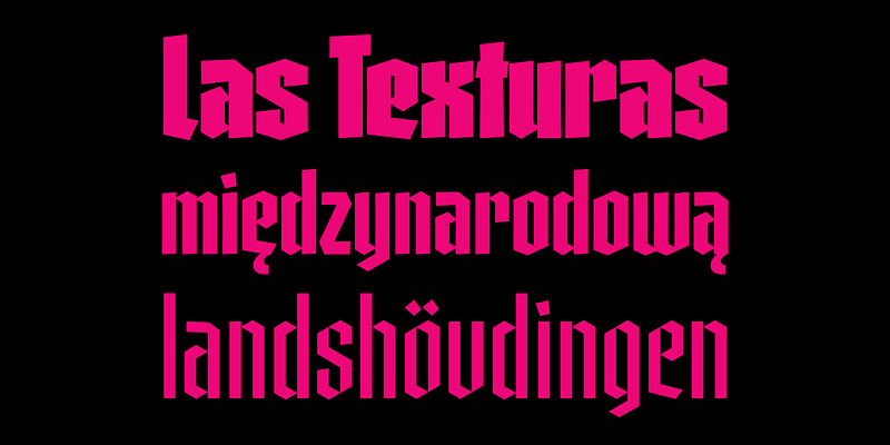
Gandur is a display textura in three weights, split into two families: Alte — the German word for old — and New. Gandur was inspired by other geometric texturas, especially Max Bittrof’s Element (1933). The design began by adhering to a strict hexagonal grid, but during its development, slowly moved from a purely geometric to a more pen-based design (this is especially true in the heaviest weights). The differences between Alte and New are essentially morphological, with reflections in the character set and OpenType features. Gandur New has a more humanistic, contemporary structure and is more ‘romanized’ then Alte. Gandur New also features small capitals. Gandur Alte, on the other hand, remains truer to historical forms, most notably: S s X x Z z. Gandur Alte also features the long-s, which can be accessed via a Stylistic Set or the glyph palette. (As is historically accurate, a short-s will be used at the end of words automatically when the historical Stylistic Set has been activated).

blackletter
foundry
commercial
Gothiks

Gothiks is a narrow 6-weight display sanserif influenced by Texturas. The rithm and verticality of Texturas can be easily identified on the letters with diagonal strokes like A N M K k V v W w X x Y y Z z: here they are all vertical. This kind of morphology was chosen because it accepts condensation in a very natural way, giving to this sanserif a very unique personality. The intermediate weights can be used for short texts while extreme weights are excellent for big sizes. It has an extensive character set — with extensive language support — and many OpenType features like fractions, small capitals and different figure sets. Default figures align with lowercase. The typeface’s name refers to the plural of the word Gothic, which in turn can refer to both sanserifs or Blackletter, depending on geographic location.

sans-serif
foundry
commercial
Haltrix

As a general rule, most script fonts are built upon elements like smooth curves and delicate swashes. The concept for Haltrix was to head in the exact opposite direction, the starting point being the designer's own handwriting. Every decision was made during development to make the letters as aggressive and angular as possible by avoiding curves and emphasizing straight line segments. Haltrix sits amongst other such scripts as Gabriel Martínez Meave's Arcana and Roger Excoffon's marvelous Mistral (as well as Elena Albertoni's homage, Nouvelle Vague). The typeface was also influenced by blackletter types, bringing a harder-edged approach than its predecessors. The typeface is a connected script reliant upon OpenType Contextual Alternate lookups, and with several alternates, swashes, and wide language support.

script
foundry
commercial
Noka

Noka is a powerful display geometric sanserif with a lot of personality. Its clean structure refers to a more digital and technological atmosphere. Letters F T L are narrower than usual to create a distinct feeling. Diagonal strokes of letters V v W w A are parallel.

sans-serif
foundry
commercial
Ofelia Display

Ofelia is a geometric sans serif able to perform very well in almost any situation. It is a versatile family of fonts available in two optical sizes, Display and Text, with just the right amount of personality. Its geometric characteristics deliver neutrality while letters like /a /f and the comma provide it with a gestural touch. The fonts are equipped with small caps, old style and tabular figures as well as alternates for /a and /l

sans-serif
foundry
commercial
Ofelia Text

Ofelia is a geometric sanserif able to perform very well in almost any situation. It is a versatile family of fonts available in two optical sizes, Display and Text, with just the right amount of personality. Its geometric characteristics deliver neutrality while letters like /a /f and the comma provide it with a gestural touch. The fonts are equipped with small caps, old style and tabular figures as well as alternates for /a and /l

sans-serif
foundry
commercial
Silva Display

Designed primarily for editorial use, Silva is a superfamily ideal to typographically complex environments requiring a highly versatile typeface. With slightly condensed proportions, generous x-height, moderated ascenders and descenders and robust serifs, it is an extremely readable and economic type. Subdivided in two optical sizes, the family has a total of 26 fonts including italics. Silva has an extensive character set — with extensive language support — that provides both old style and lining figures as well as their respective tabular versions, fractions, various ligatures, small capitals, arrows and a number of different symbols.

serif
foundry
commercial
Silva Text

Designed primarily for editorial use, Silva is a superfamily ideal to typographically complex environments requiring a highly versatile typeface. With slightly condensed proportions, generous x-height, moderated ascenders and descenders and robust serifs, it is an extremely readable and economic type. Subdivided in two optical sizes, the family has a total of 26 fonts including italics. Silva has an extensive character set — with extensive language support — that provides both old style and lining figures as well as their respective tabular versions, fractions, various ligatures, small capitals, arrows and a number of different symbols.

serif
foundry
commercial