Bijou Type

2 fonts
Gloridot

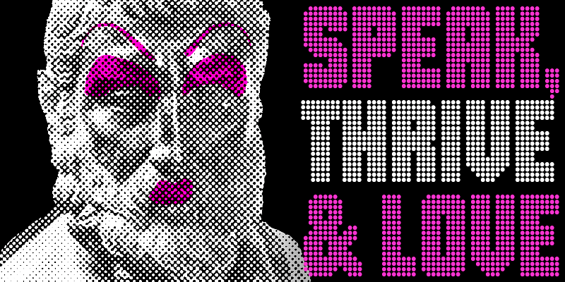
Gloridot is meant for big, solid headlines and titles. The design began with a handful of letters from an unidentified typeface on old magazine cover that Dan Rhatigan was trying to recreate for an issue of his zine, Pink Mince. The grid of dots that formed those few glorious letters at first seemed like a simple system for constructing an alphabet, then grew into a fascinating puzzle as the system expanded into a typeface supporting about 505 languages, plus symbols that can be used to create borders and patterns. For additional license options like app, enterprise, multi-user, and self-hosted web, visit [Gloridot on Type Network](https://store.typenetwork.com/foundry/bijoutype/fonts/gloridot).

display
foundry
commercial
Ringold

Ringold is for those bold, solid headlines with letters that need to be tight without quite touching. Adjust the tone of your text with faces within the family that share the same proportions and density, but with a shift in personality from one style to the next. Ringold Clarendon is a bit whimsically nostalgic. Ringold Slab is its sharper, more buttoned-down cousin. Ringold Gym beefs up the Slab and makes it more architectural. Ringold Sans takes off the serifs but holds on to some of the warmth. Ringold Soft is a smoother, friendlier spin on the Sans. The 5 styles each support about 505 languages. For additional license options like app, enterprise, multi-user, and self-hosted web, visit [Ringold on Type Network](https://store.typenetwork.com/foundry/bijoutype/fonts/ringold).

slab-serif
foundry
commercial