0123456789
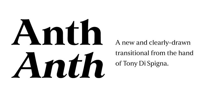
Explore Anth designed by Anthony DiSpigna at Adobe Fonts.
sans
modern
sans-serif
Explore Anth designed by Anthony DiSpigna at Adobe Fonts.
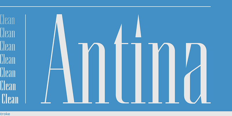
Antina emerged from Tony's development of the Thinstroke logotype. Its sharp and clean lines and rational structure adapted well to a large family of weights. For additional license options like app, enterprise, multi-user, and self-hosted web, visit [Antina on Type Network](https://store.typenetwork.com/foundry/thinstroke/fonts/antina).
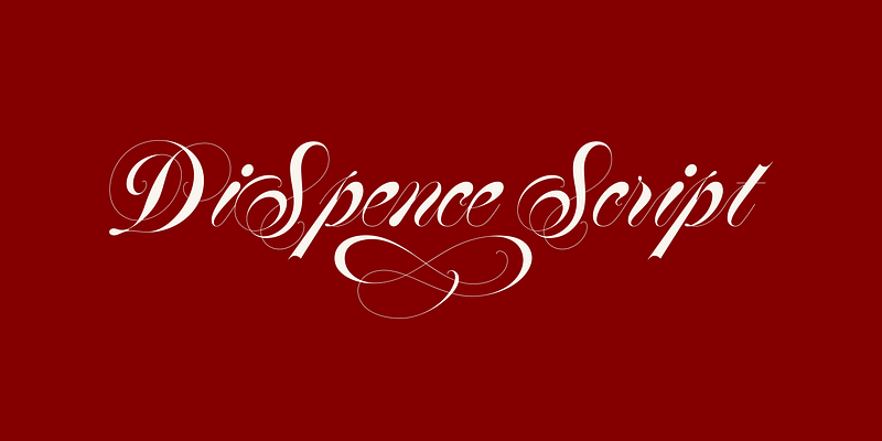
An extremely refined and elegant Specerian design with marvelously thin strokes, DiSpence Script performs best at slightly larger sizes. Hand-penned by Tony DiSpigna, DiSpence uses true hairlines for the thinnest strokes. For additional license options like app, enterprise, multi-user, and self-hosted web, visit [DiSpence on Type Network](https://store.typenetwork.com/foundry/thinstroke/fonts/dispence-script).
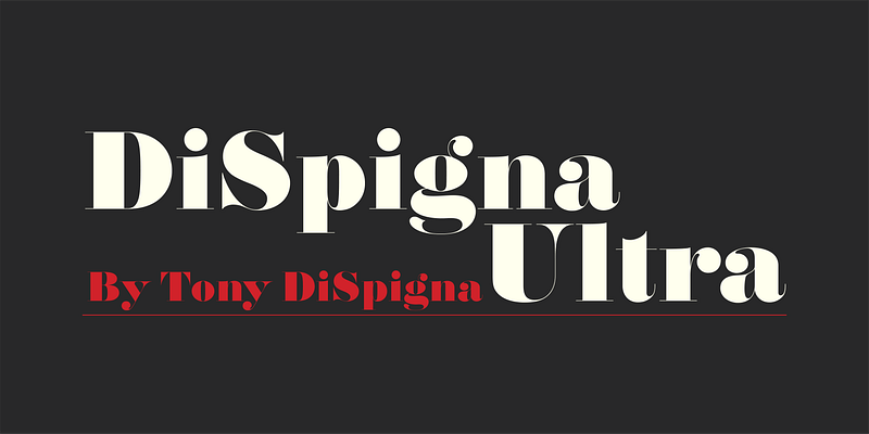
When I got out of school at Pratt in 1967, I fell in love with Herb Lubalin's posters of his new typefaces, especially Pistilli Roman. ( So, in 1969, I designed DiSpigna Roman in pencil on tracing paper, and executed it on heavy stock bond paper with the traditional ink and white clean up paint-the way we did all executions of letterform and typefaces back then. It became one of the first faces we digitized when we created Thinstroke. This typeface harkens directly back to 1969. I still love Pistilli, but I do think my DiSpigna Ultra is heavier with more luscious curves. For additional license options like app, enterprise, multi-user, and self-hosted web, visit [DiSpigna Ultra on Type Network](https://store.typenetwork.com/foundry/thinstroke/fonts/dispigna-ultra).