Alan Meeks

13 fonts
Astoria

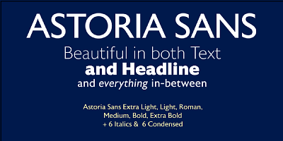
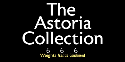
Based heavily on Gill especially in the mid weights, Astoria has a subtle top left serif which makes it not quite a Roman and not quite a Sans. Designed specificaly as a text face it still works very well as a headline font.

serif
foundry
commercial
Astoria Sans

The Sans serif companion to Astoria. Based heavily on Gill especially in the mid weights and with a consistent series of condensed weights. Designed specifically as a text face it still works very well as a headline font.

sans-serif
foundry
commercial
Brigade

In searching for a Roman to use there were bits of Bembo, Times, Garamond etc. that I liked and bits that I did not. So I set out to take the best bits of all my favourite Romans and tried to create the ultimate Roman Typeface.

foundry
commercial
adobe
Chalfont

The typeface was designed after seeing a photocopy of some News Gothic text where the ink had faded on the bottom of each character. As character recognition is generally based on the top half of a character, readability was never compromised. Rather like Antique Olive the characters have a top heavy look when viewed straight on, however, as most type is

serif
foundry
commercial
Chalky

More condensed than most fonts of this style, Chalky can be used in relatively long settings without losing legibility.

handwritten
foundry
commercial
Colosseum

Although a sans serif, Colosseum owes its style to the original Trajan Roman form. Borrowing some characteristics from Friz Quadrata, in its sans serif form it is more adaptable to text usage whilst still having a modern and original look which works well in headlines.

sans-serif
foundry
commercial
Copacabana

Copacabana is heavily based on one of my favorite typefaces Goudy Old Style Italic. It is sharper and more clearly defined than Goudy yet still retains its old style characteristics. The face is slightly angled so is basically upright whilst still retaining Italic characteristics

foundry
commercial
adobe
Dublin

Classic Celtic style of lettering with an alternative set of capitals and a few alternative lower case.

foundry
commercial
adobe
Fairway

The thinking behind Fairway was to create a relatively conventional soft sans with a certain amount of movement at the top of the x-height line. The face is casual and quirky but can still be used as a text face.

sans-serif
foundry
commercial
Kestrel Script

Originally designed in 1985 and released by Letraset for dry transfer Lettering, Kestrel has, until now, never been digitized. The face now has been completely re-drawn and digitized for all formats. It is a heavy formal script similar in form to Commercial Script.

script
foundry
commercial
Park Lane

A Classic Italic Roman with a set of alternative swash caps and a number of original swash lower case charactures that can create a number of unusual ligatures when connecting to the preceding characters. Available in two weights Light and Bold.

serif
foundry
commercial
Pinot Grigio Modern

A modern update of the unique sans display font Peignot originally designed in 1937 by A. M. Cassandre. The font has been modernised by making all the terminals soft and making a larger x height and lessening the contrast between thick and thin.

sans-serif
foundry
commercial