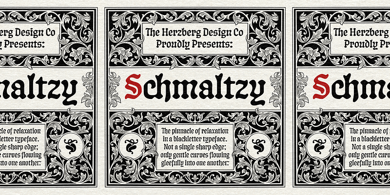
Schmaltzy is about as relaxed as a blackletter can get. It contains not a single sharp edge, only smooth curves flowing gleefully into one another. This concept was once applied by Oswald Cooper to his Roman typeface, Cooper Oldstyle, the most famous weight of which saw popular success under the name “Cooper Black”. It could be said that Schmaltzy is to a blackletter what Cooper Oldstyle is to a Roman: Cooper Blackletter. But that’s a bit reductive. Schmaltzy is also a modernization of classical blackletter faces, legible to today’s reader and with far fewer connotations than other blackletters. If you’re looking for a fresh, friendly, and highly usable take on the genre, look no further. Ultimately based on calligraphic hands, Schmaltzy merges a weight and width-axis into one: a nib size axis. As the weight goes up, the typeface expands in width considerably too, which can help you fit your type more easily, as well as allow for dramatic contrasts. By default, Schmaltzy’s characteristics are more vanilla: the standard capitals are more akin to Roman forms, which makes them easily recognizable to today’s eyes, and appropriate for use in an all-caps setting. However, with a click of the button, they can be switched to beautiful, ornamental fraktur caps–great for a more historic or fantasy vibe. Similarly, Schmaltzy contains an abundance of alternates and opentype features that allow you to control the level of spice, and generally help you set some powerful, versatile type. It’s all about the details, and this beauty has lots of them! As always, Schmaltzy has lots of extended Latin alphabet support (Latin Plus, to be exact), supporting over 200 languages. Where unicode fails, built-in localized form features step in to assure optimal typography. For additional license options like app, enterprise, multi-user, and self-hosted web, visit [Schmaltzy on Type Network](https://store.typenetwork.com/foundry/herzbergdesign/fonts/schmaltzy).