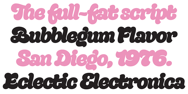
This is Quinella, plumper than a misguided Z-lister’s dodgy lip job. Named after those cheffy scoops of ice cream, quenelles. It’s a cute, voluptuous script with a seventies vibe and a personality all its own. It’s non-connecting in the usual sense, but the letters overlap to make the white space as tiny as possible. The full-fat, creamy appearance makes it perfect for food packaging, but don’t let it end there; it’ll make memorable logos, unmissable headlines, and posters with more punch.