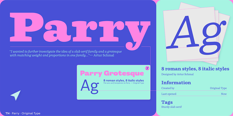
Parry has its roots in the robust slab serif and sans serif typefaces that appeared in the Victorian age. It is not a revival though, and its aesthetics make it truly a contemporary typeface. The soft curves and quirky serifs combine with sharp cut stroke terminals to produce a text image that is softer than the rigid nature of most slab serifs. Since its release, Parry and Parry Grotesque have proven to be extremely versatile typefaces. Coming in regular and condensed widths, it is a comfortable and reliable choice for a wide range of applications. From corporate identities to subtitle book typography, from magazines to billboard-sized advertising campaigns. For additional license options like app, enterprise, multi-user, and self-hosted web, visit [Parry on Type Network](https://store.typenetwork.com/foundry/originaltype/series/parry?family=parry).