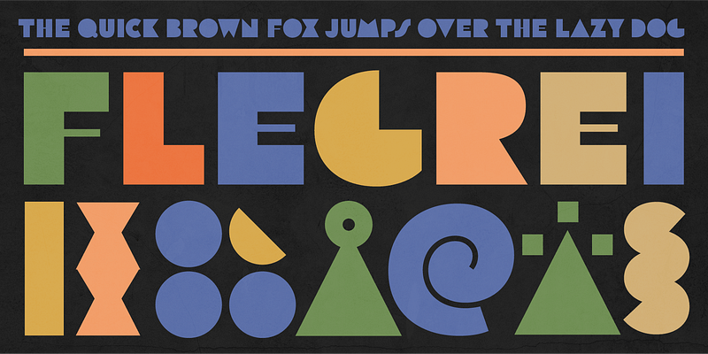
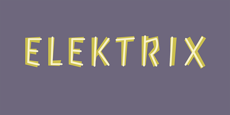
The Tipoteca Series is a family of three typefaces resurrected from the rich wood type collection of the popular letterpress museum and archive [Tipoteca Italiana](http://www.tipoteca.it/en/) in Cornuda, Italy. This explosive series marks vol. II of Adobe’s [Createfulness](https://www.adobe.com/de/creativecloud/createfulness.html) campaign, following the digital revival of 1920s graphic elements, symbols and pictograms from a handful of European metal type foundries, including Deberny & Peignot, Nebiolo and Trennert & Sohn. In the spring of 2019, the design team of [p98a.berlin](https://www.p98a.com/about) rediscovered Tipoteca’s expressive wood type alphabets from various manufacturers, curated a small selection and made letterpress proofs from the original wooden letters for the purpose of restoring them digitally. Berlin-based type designer [Ulrike Rausch](https://fonts.adobe.com/designers/ulrike-rausch) carefully redrew the alphabets, expanded the character sets and added stylistic alternates as well as other OpenType features. Flegrei is a geometric expressionist. Constructed from ruler and compass, A and O make a bold statement by simply appearing as triangle and full circle. Flegrei has no enclosed counters, lending all lines of text a black texture and strong contrast between words. Hairlines planted in E, F and H bloom as spots of elegance. Its extended character set includes stylistic alternates, including a Pac-Man-like C, an H with a bold crossbar and a more reasonable, space-saving S. Italians call the @ symbol chiocciola, meaning snail—look at this one and you know why. Let’s be frank, Flegrei is no text typeface, but its charming flat-surfaced appearance cuts a fine line in any title sequence.