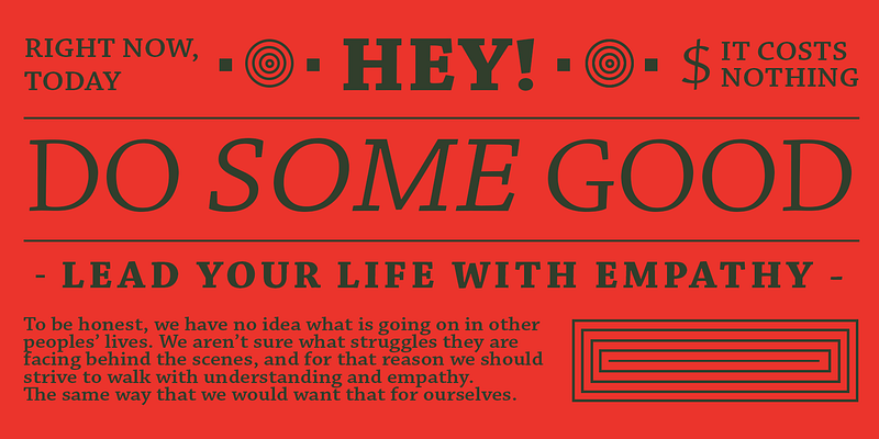
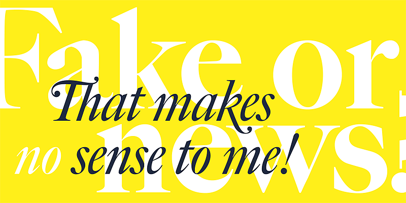
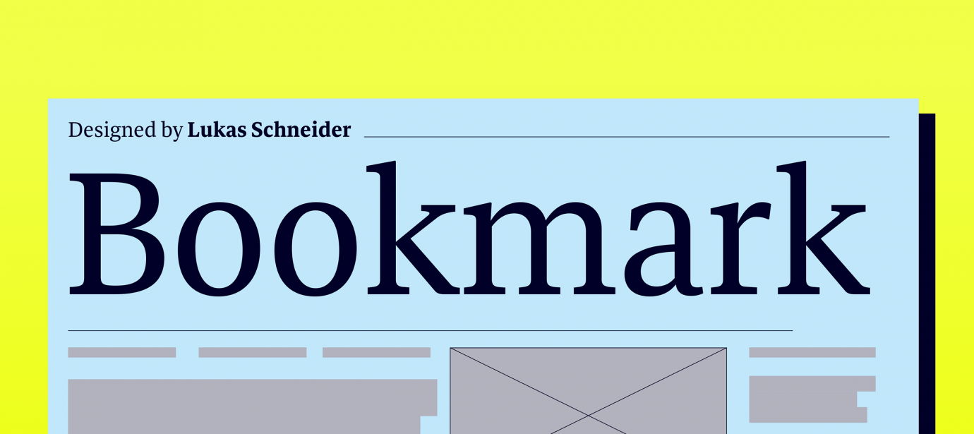
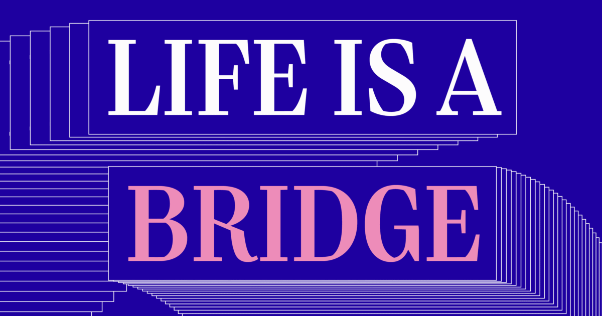
Created by Adobe type designer Carol Twombly, Chaparral combines the legibility of slab serif designs popularized in the 19th century with the grace of 16th-century roman book lettering. The result is a versatile, hybrid slab-serif design, a unique addition to the Adobe Originals family of typefaces. Unlike “geometric” slab serif designs, Chaparral has varying letter proportions that give it an accessible and friendly appearance in all weights from light to bold. And because it’s a multiple master typeface with an optical axis (ranging from 7 to 72 points), Chaparral is clear and readable at smaller text settings while remaining subtle and lively at display sizes. Like the drought-resistant brush that blooms on the arid coastal range near Twombly’s California home, Chaparral’s highly functional design is surprisingly beautiful, the perfect choice for correspondence, as well as book, poster, and newsletter design.