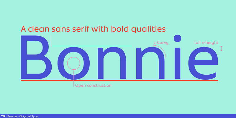
Bonnie was born out of the desire for a clean sans serif that combined the bold qualities of geometric typefaces from the twentieth century with soft and human qualities that produce a friendly atmosphere. Bonnie’s capitals speak a powerful and clear language, while its lowercase characters—with their large x-height, open construction, and curvy details—ensure that it addresses both aesthetics and functionality. Coming in three widths, Bonnie is a great tool for copy fitting in a variety of layouts. For additional license options like app, enterprise, multi-user, and self-hosted web, visit [Bonnie on Type Network](https://store.typenetwork.com/foundry/originaltype/fonts/bonnie).