0123456789
Chairman Display is a calm neo-grotesque for tight headlines that let content lead. Rational in construction and economical in form, it reduces letterforms to their essentials without losing human warmth.
display
foundry
commercial
Chairman Display is a calm neo-grotesque for tight headlines that let content lead. Rational in construction and economical in form, it reduces letterforms to their essentials without losing human warmth.
Drawing on typewriter faces built for tough printing conditions, Chairman Mono simplifies shapes and opens apertures to aid readability — for editorial use, and code.
Chairman Semi-Mono preserves the feel of a typewriter while adjusting character widths for an even reading texture — a middle ground between proportional and mono.
Chairman Text is an industrious sans for small sizes. Shaped by strict functional demands, it lets expressive details surface, giving running text a quiet spark.
Pristine is a charismatic multiscript typeface family known for its warm personality and distinctive teardrop terminals. It is designed to lend a friendly feel to both headlines and short text, making it suitable for a variety of applications in print and web design.
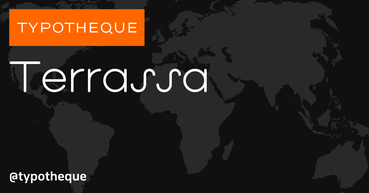
Terrassa is a modular display typeface that blends geometric precision with architectural expressiveness. It draws inspiration from the monolinear lettering found in architectural drawings, achieving a balance between rational letterform construction and visual rhythm. This typeface is well-suited for both print and web applications.
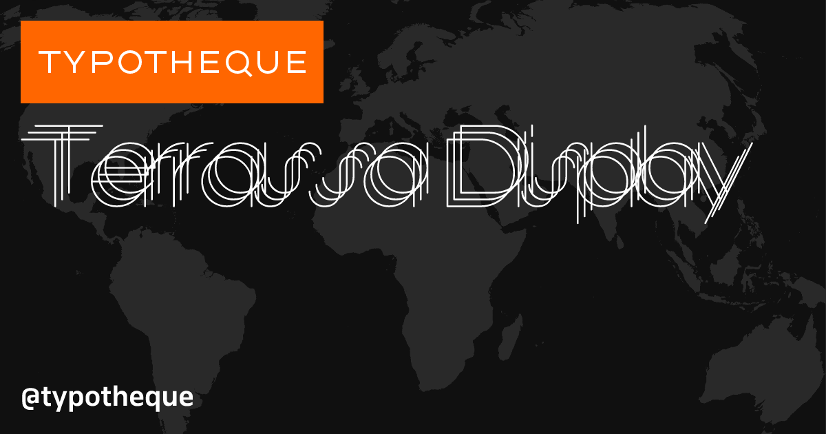
Terrassa Display is a geometric typeface inspired by architectural lettering. It reinterprets the precision of technical drawings, balancing structural clarity with expressive variation. Designed for visual rhythm and spatial typography, it transforms geometry into language.
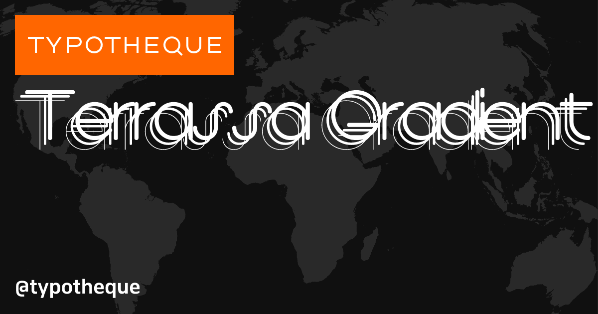
The most expressive variation of this geometric typeface, Terrassa Gradient brings a layered gradation of weights across repeated letter outlines. It is inspired by architectural lettering and created for striking typography that gives text visual depth.

Zed Display Semi-Condensed is a space-saving grotesque typeface for compact and impactful headlines.

The broader proportions of the Zed Display Semi-Wide make it comfortable to
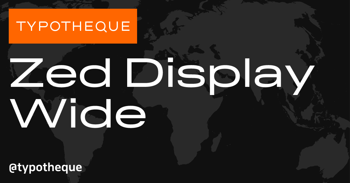
Zed Display Wide is a generously proportioned grotesque typeface that lends a simple and unpretentious sense of abundance to text.
Zed Icons is a collection of two thousand meticulously crafted icons designed to transcend language barriers, providing clarity in situations where words or translations fall short. The icons are available in a variable range of weights, optical sizes, and visual styles, ensuring a cohesive visual experience when paired with various typefaces.

The clarity of Zed Round makes it suitable for user interfaces in apps and websites, especially those aimed at a wide audience. Its soft appearance makes digital environments feel more welcoming and less formal, enhancing the user experience.

With its space-saving and approachable design, Zed Round Compact is an excellent choice for a friendly and inviting user interface or for brand communication.


Zed Text Semi-Wide features slightly wider proportions, making it suitable for distance reading and small text in interfaces. Its humanist sans construction promotes ease of reading and emotional accessibility, making it a versatile choice for both print and digital applications.