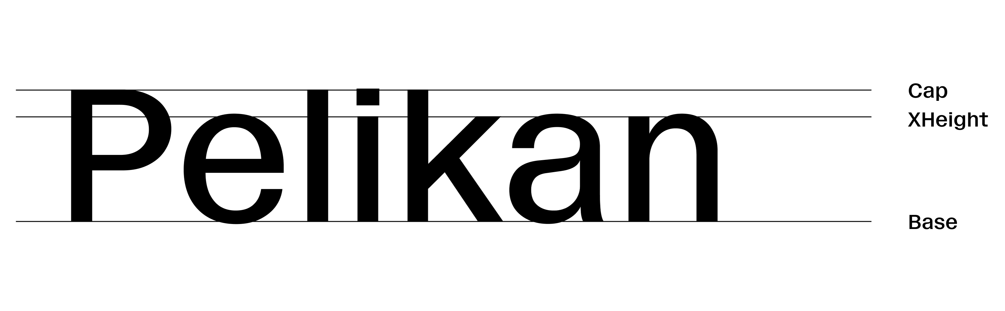
When the AACC decided to undertake their rebranding, Aaron Levin, in charge of the project, asked Black[Foundry] to craft a unique typeface to match the ideas he had in mind for the visual identity of the organisation. Our Vesterbro font in its Poster weight already had hints of the desired output, but we brought more softness to it with ball terminals and made it more compact while retaining its striking boldness. The contrast between thicks and thins was increased and the glyphs were narrowed for tighter spacing. After several iterations we acheived the right balance between institutional/formal and creative/funky aspects, both being emphasized in the new AACC identity. Aaron's admiration for Herb Lubalin's work played a role in the design of the Blaacck typeface. Ligatures were added as well as engaging, almost ornamental punctuation symbols. The concept behind this typeface is also to enable super-compact typesetting both horizontally and vertically. For this reason, the lowercase x-height is fairly high, the accents are reduced to thin hairlines, and flattened on the capitals to allow for tight leading. We also increased the compactness by pushing some ball terminals into the letter-shapes (as seen in the 'r' or the 'f', 'J' and 'Q'). The Blaacck typeface, is a creative tool for designing striking headlines, and it covers a wide glyphs set including all the necessary accents for all European languages as well as Vietnamese, a set of arrows, alternates for 'r' and '&', ligatures, and dynamic fractions, as set by Black Foundry's standard.